Articles15 min read

Paper Art for Living Room: A Complete Guide to Layered Wall Decor That Actually Fits the Room

The sizing, palette, and placement playbook for hanging layered paper art in a living room — the formulas, the shadow-box-vs-flat decision, and the placement rules I proved on my own 84-inch-sofa wall.

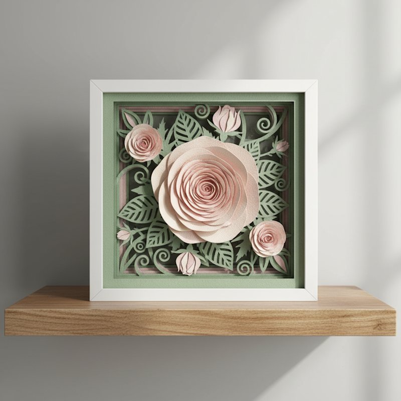
A finished layered paper shadow box of a blooming rose scene in a white frame on a shelf in daylight

The first layered paper piece I hung in my living room was a 12×12 hydrangea shadow box I cut in three blues and centered above an 84-inch sofa. It looked lost. The frame covered maybe a third of the sofa's width and floated on the wall like a postage stamp. I took it down, re-cut the same template as a wider three-panel piece spanning about 70 percent of the sofa width, and hung the bottom edge eight inches above the back of the sofa. Same wall, same template, completely different presence — that second version is the one guests walk up to. The lesson I keep relearning: paper art for living room walls is a sizing and placement problem first, and a style problem second.

That is the gap this article fills. When you search paper art for living room, almost every result is either a marketplace listing (Etsy, Amazon, Wayfair) or generic "wall art ideas" decor content that never engages with the actual format — how deep a shadow box should be above a sofa, how wide a piece reads as a statement versus clutter, how paper art plays with the textures already in the room. Layered papercut is a different beast from a flat print: it has real depth, it throws shadow, and it is light enough to mount without anchors — which means it suits living rooms in ways heavy framed canvas simply cannot. And because MMA sells digital SVG templates rather than finished art, you produce the piece yourself from cardstock, calibrated to your room, for a few dollars instead of a commission.

This is the practical guide. If you want the format fundamentals — what a layered shadow box is and how to cut one on a Cricut or Silhouette — start with our how to make a shadow box with Cricut or Silhouette walkthrough and come back here for the living-room-specific rules. If you want the restraint version (white-on-white, monochrome, Japandi), our minimalist paper wall art guide is the companion piece. This article is the one that tells you how big, how high, in what palette, and on which wall — so the finished piece reads as intentional decor rather than a craft that wandered out of the workshop.
Why Layered Paper Art Works So Well in a Living Room

A living room is the room people sit in long enough to notice detail. That is exactly where flat prints underperform — from across the room they read as a flat rectangle, and up close there is nothing to reward the second look. Layered paper art solves both distances at once. Stack three to seven cut cardstock layers with foam spacers inside a frame and every edge throws its own micro-shadow; from the sofa it reads as a single sculptural object, and from arm's-length the depth rewards the viewer. That is the texture a living room wall is usually starving for.
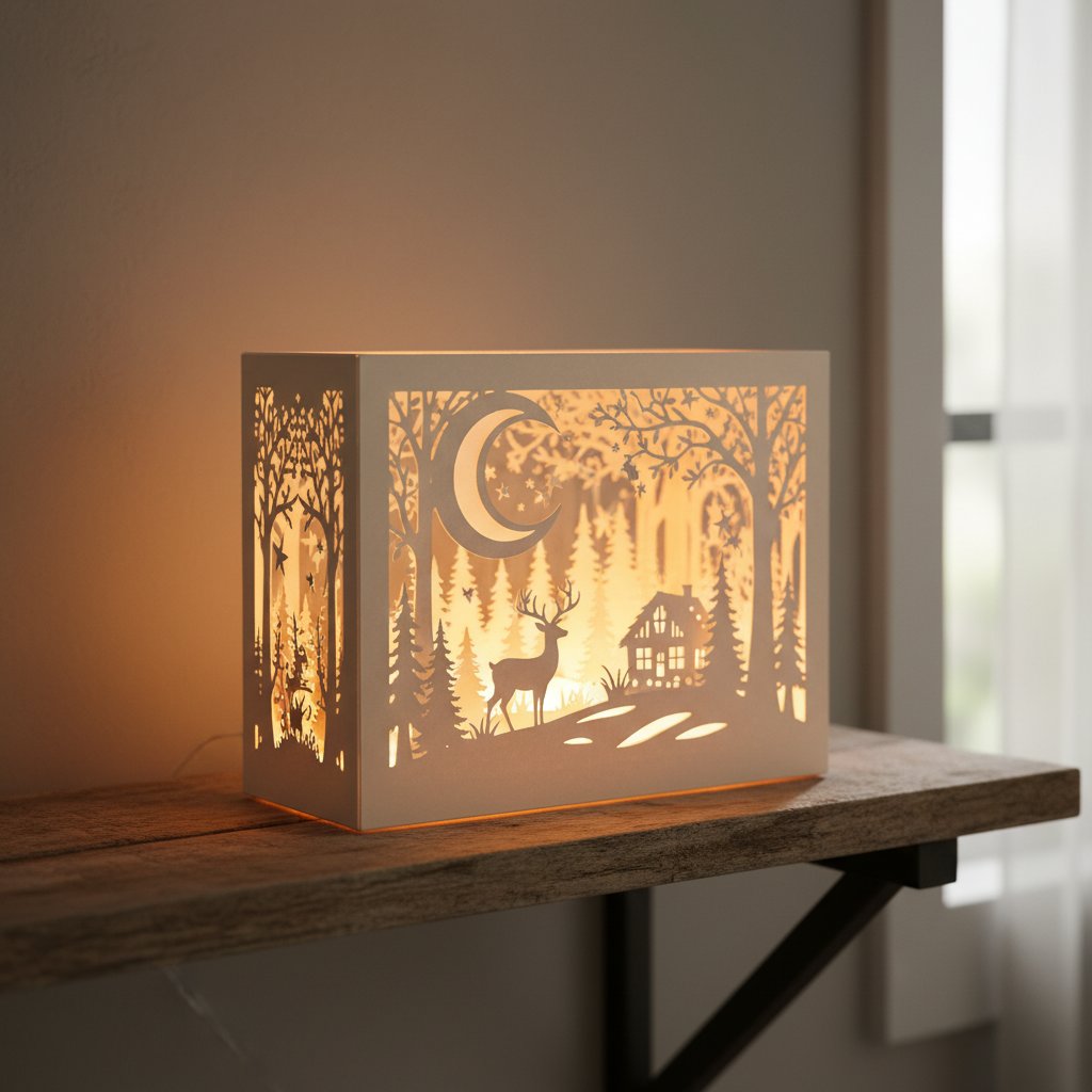
An illuminated layered paper-cut shadow box glowing warmly as a focal point on a wooden shelf in a cozy room

Four things make the format especially suited to living-room use:

  • It is light. A framed layered paper piece weighs a fraction of a glassed canvas of the
    same size, so you can mount a large statement piece on a drywall wall with simple anchors
    — no stud-hunting, no heavy-duty hardware.
  • It is customizable to the room. You choose the cardstock palette, so the art can pick
    up an accent color from your rug or throw rather than fighting it.
  • It is affordable to scale. Because the template is a digital download and the raw
    material is cardstock, a 24×36 statement piece costs roughly the same in materials as an
    8×8 — a few dollars of paper plus one frame.
  • It catches light differently through the day. Layered depth means the piece changes
    character from morning side-light to evening lamp-light, which is what gives a living
    room wall a sense of being lived-with rather than staged.

The catch — and this is the whole game — is that the same template can look like gallery decor or like a craft project depending on how you size, frame, and place it. That is what the rest of this article controls.

Botanical Layered Templates That Sit Naturally in a Living Room
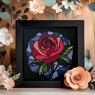
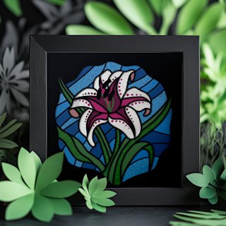
The fastest path to paper art that reads as living-room decor (not craft) is a single botanical subject cut in a palette that matches your room. Our hydrangea, rose, and lily shadow box SVG templates are built for exactly this — each is one clean focal bloom, so the moment you cut it in warm-white-on-cream for a Scandinavian room, soft sage for Japandi, or warm terracotta tones for a boho space, it reads as intentional wall decor. Download instantly, cut on any Cricut or Silhouette, and assemble at 8×8 or scale up to a 12×12 or wider multi-panel statement for above the sofa. No shipping, no wait — just the file and your cardstock.

Choosing Paper Art Style by Living Room Design

The right paper art for your living room depends more on the room's design language than on the art itself. These are the pairings I have tested on real walls — the template subject and palette that reads as "belongs" in each style.

Scandinavian

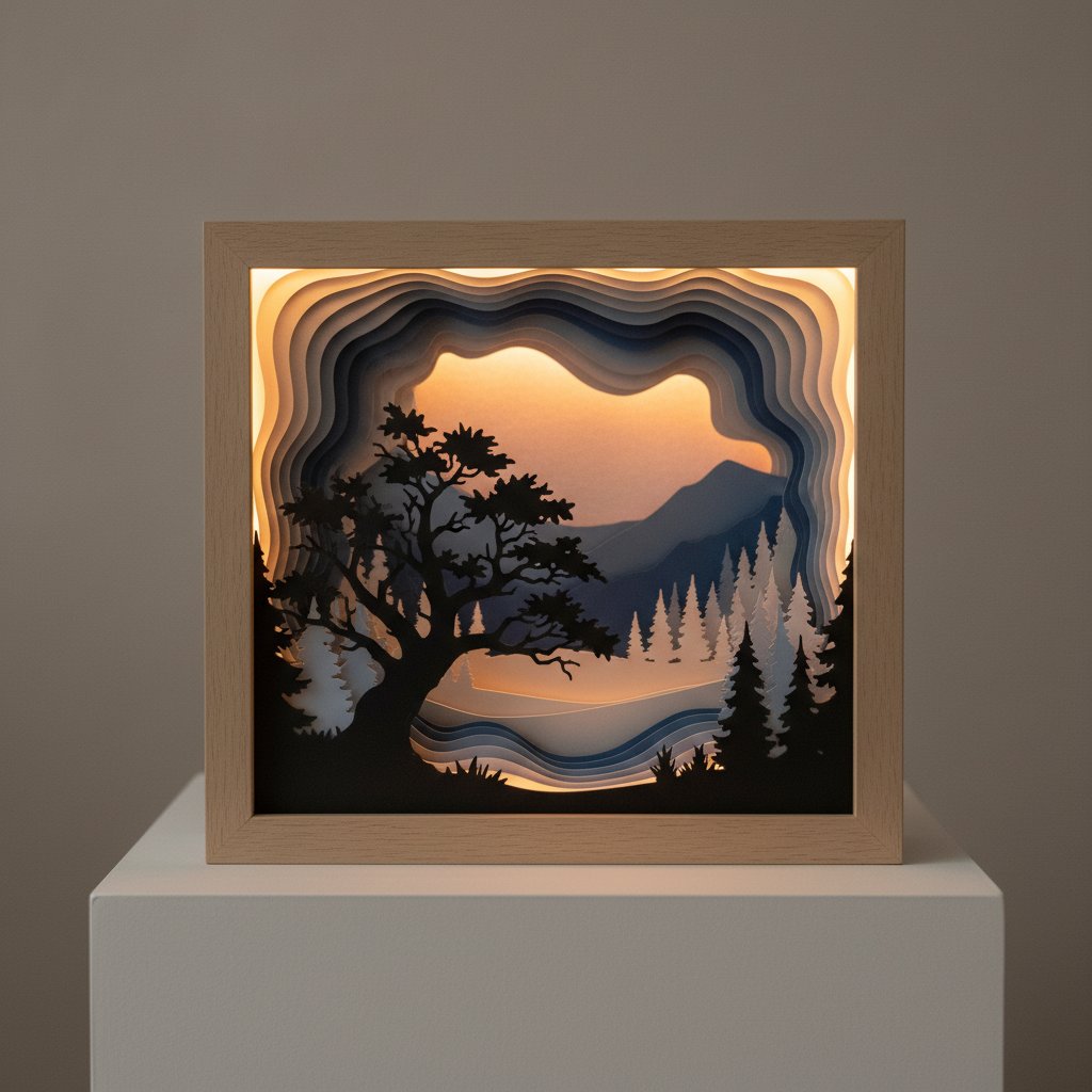
Pale woods, whites, soft greys. Reach for single-subject botanicals or bare-tree silhouettes cut in white-on-warm-white, pale grey, or soft sage. Keep the frame in natural oak or matte white. The depth stands in for the texture Scandi rooms usually get from textiles — one right-sized piece above the sofa is enough.
A layered paper-cut shadow box nature scene with tree silhouettes showing dramatic depth through multiple layers

Boho

Warm earth tones, organic shapes, layered textures. Botanicals win here — a rose, hydrangea, or wildflower template cut in terracotta, rust, mustard, and warm cream reads as glob-trotting and warm rather than fussy. A natural wood or thin gold frame ties it to the brass and rattan boho rooms already use.

Modern / Mid-century

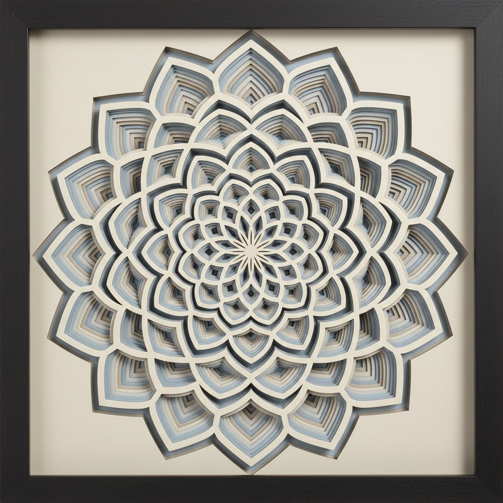
Crisp geometry, high contrast, clean lines. Geometric mandalas, abstract line work, or single-silhouette architectural cuts in black-on-cream or a restrained two-tone palette suit the structured energy of a mid-century room. Frame matte black, thin profile.
A finished layered paper shadow box featuring an intricate geometric mandala design in a dark frame

Farmhouse

Muted country palette, rustic wood textures. Rural and seasonal motifs — a bare tree, foliage, or a quiet landscape — cut in muted browns, sage, and cream and set in a reclaimed or natural wood frame read as farmhouse rather than craft-fair. Avoid bright primaries.

Traditional

Classic, symmetrical, heritage. Architectural silhouettes, classical florals, or formal line work in a restrained palette (cream, soft black, muted gold) inside a deeper, traditional-profile frame. Pair as a symmetrical two-piece arrangement over a console or fireplace for the formal-balance look traditional rooms expect.

Sizing Paper Art for Living Room Scale (The Formulas That Actually Work)

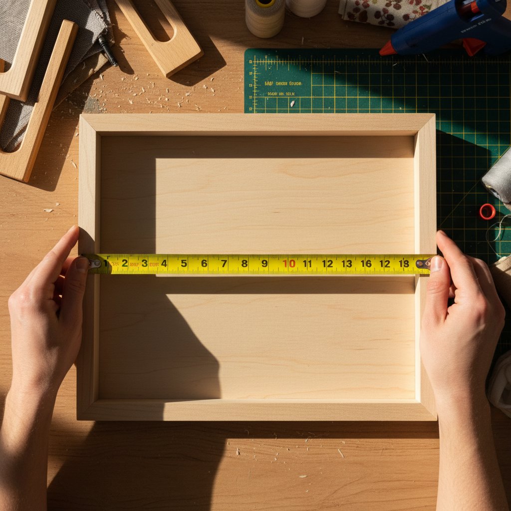
This is the section that fixes most "it looks wrong on the wall" problems. Sizing is not a matter of taste — there are working formulas, and undersizing is the single most common mistake I see (and made). When in doubt, go bigger; almost everyone buys or cuts a piece one size too small for the wall they have.
A measuring tape across a shadow box frame interior demonstrating proper measurement technique for accurate sizing

Above the sofa

The piece (or grouped pieces together) should span 60–75% of the sofa's width, with the bottom edge 6–10 inches above the top of the back. For my 84-inch sofa that meant a grouped width of roughly 50–63 inches; the 12×12 single I started with (12 inches wide) was barely 14% of the sofa width — nowhere near enough, which is why it looked like a postage stamp. Center the grouping on the sofa, not on the wall.

Above the fireplace mantel

Aim for about two-thirds of the mantel width, with the bottom edge 3–6 inches above the mantel and the top no higher than 12 inches above it. Going wider than the mantel itself reads as top-heavy; going too high disconnects the art from the mantel and looks floating.

Large empty wall

Size the piece to roughly two-thirds of the wall's usable width (usable=wall minus furniture that backs up to it), and center the art so its midpoint sits at eye level, about 57 inches from the floor — the gallery-standard hanging height. A single large statement piece almost always beats a scatter of small ones on a big wall.

Mix sizes with 2–3 inches of consistent spacing between frames. Keep frame finishes identical (mixed finishes read as clutter fast). Lay the arrangement out on the floor first and measure the total grouped footprint — it should still follow the 60–75% rule relative to the furniture below it.

TV wall

If the TV is staying, hang the art slightly wider than the TV on one side (a vertical pair flanking it, or one tall piece to the side), or go directly above with the bottom edge 4–6 inches above the TV. A single piece exactly the same width as the TV reads as visual competition — offset instead.
For the frame depths that pair with these sizes, our frame size and depth guide for paper-cut shadow boxes has the exact measurements and the layer-count-to-depth mapping.

Architectural and Abstract Cuts for Modern and Traditional Living Rooms
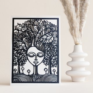
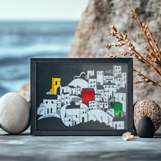
For a modern, mid-century, or traditional living room, abstract and architectural subjects bring structured energy without leaning on color at all. The Mind Tree papercut reads as a contemplative single-subject piece that suits a neutral modern wall; the Mediterranean Seaside Houses template captures clean architectural line work that fits a traditional or coastal-traditional room. Cut either in warm-white, soft grey, or black-on-cream, drop them in a thin matte black or natural-oak frame, and you have a living-room statement piece you made yourself. Instant SVG download, Cricut- and Silhouette-ready.

Shadow Box vs. Flat Paper Art: Which Belongs in Your Living Room?

Both are "paper art," but they behave differently on a living-room wall. I have hung the same botanical subject as a deep shadow box and as a flat float-mounted cut on the same wall a week apart, and the difference is bigger than you would expect.
A deep layered paper-cut shadow box viewed at an angle showing paper layers receding into depth

Shadow box — when to choose it

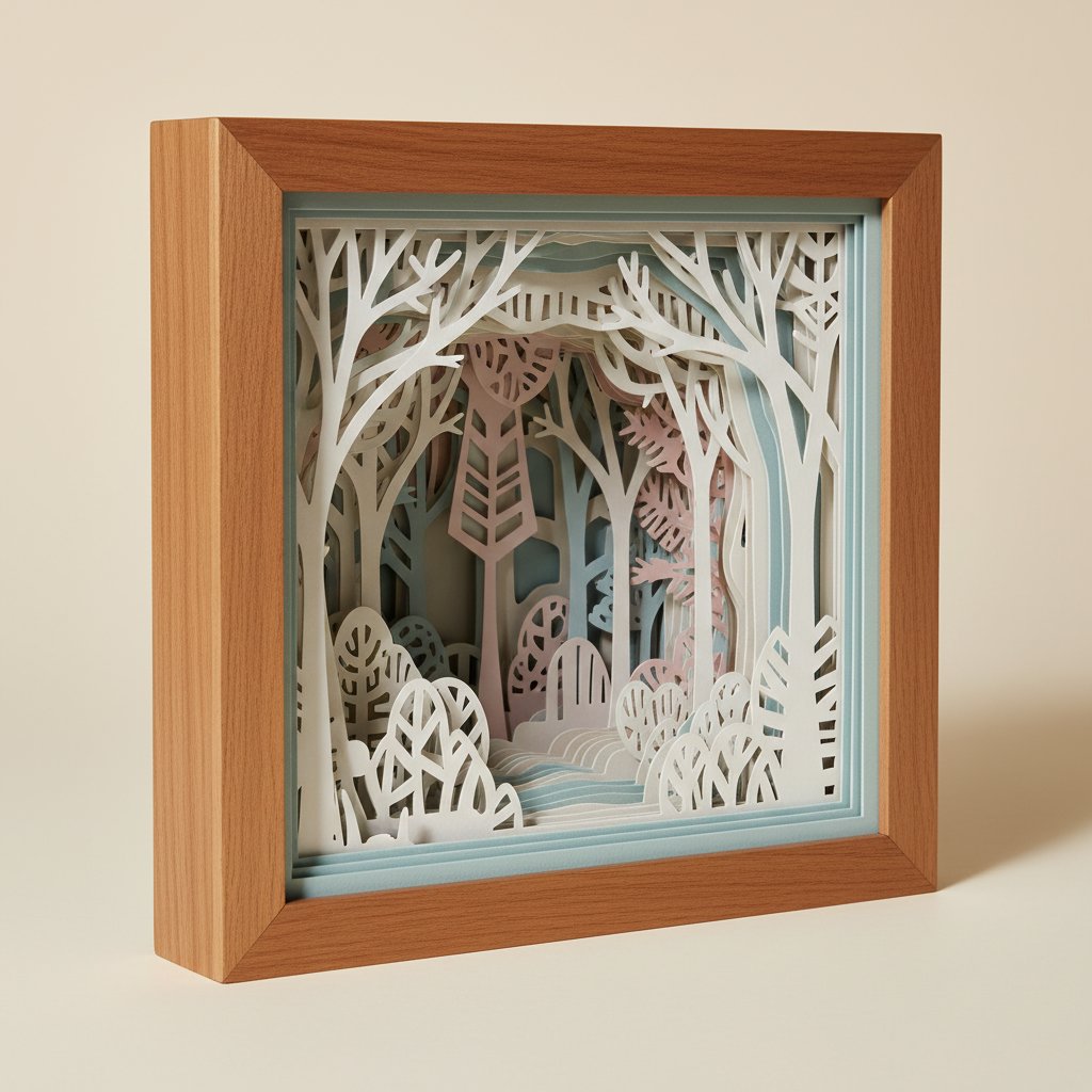
A shadow box stacks cut layers with spacers inside a deep frame (typically ¾ to 2.5 inches deep), so the piece has real, measurable depth. Choose it when you want the art to be a focal point — above a sofa, on a large empty wall, or anywhere you want the light to catch the layers. It pairs beautifully with backlighting (drop LED fairy lights behind the back layer and the whole piece glows). The trade-offs: a shadow box is heavier (still light vs. canvas, but heavier than a flat cut), the frame is deeper so it casts its own shadow on the wall, and the interior can trap dust over time.

Flat paper art — when to choose it

Flat paper art is a single cut layer (or a shallow 2-layer piece) mounted flat against a backing, usually float-mounted or matted, with a very thin profile. Choose it when you want a sleek, modern, minimalist look — in a small living room where a deep frame would feel intrusive, in a gallery wall where mixed deep frames would read as clutter, or anywhere the room is already busy and the art needs to stay quiet. Flat art is easier to dust, easier to group, and reads as a graphic element rather than a sculptural object.

The quick decision

  • Want depth, shadow, and a single statement piece? Shadow box. - Want sleek, graphic, quiet, or a gallery wall of several pieces? Flat. - Living room gets strong side-light or you want to backlight? Shadow box (the depth
    will perform).
  • High-traffic room with kids likely to bump the wall? Flat, or a shadow box behind
    glass — flat is easier to keep clean.

Cost

Shadow boxes cost more to make because you need a deeper frame and more cardstock layers; flat paper art runs cheaper (one frame, one or two sheets). Both are still a fraction of commissioned framed art.

Color Palettes for Living Room Paper Art

Palette is where a paper piece either locks into the room or fights it. The working rule: pick up one existing color in the room and let the art live inside that family, with at most one quiet accent. Here are the palettes I keep coming back to, each tested on a real living-room wall.
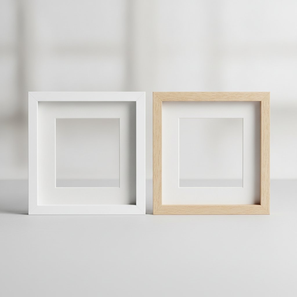
Two empty deep shadow box frames side by side, one white and one natural birch wood, showing interior depth

Neutral living rooms

If your walls, sofa, and rug are neutral (white, cream, grey, greige), reach for layered whites, creams, and soft greys. The warmth differences between layers are what make the cut readable — pure white on pure white disappears. Use warm-white cut layers on a cream back layer and the piece reads as subtle depth rather than blank paper.

Bold accent walls

On a saturated wall (deep blue, forest green, terracotta), use complementary paper layers so the art pops instead of disappearing. A warm-cream and soft-gold botanical on a deep navy wall is one of the most effective pairings I have hung — the contrast does the work.

Earth-toned spaces

Warm browns, terracotta, olive, mustard, cream. This is boho and farmhouse territory — botanicals cut in this family read as warm and collected. I once cut a hydrangea in three blues for an earth-toned room and the cool blue fought every other surface; re-cutting in terracotta and warm cream made it belong.

The 3-color ceiling

Whatever palette you choose, hold to a maximum of three colors in the layer stack. Past three, layered paper stops reading as designed and starts reading as busy — the eye cannot find a focal edge to rest on. One hue family plus one accent beats four unrelated colors every time.

Test before you commit

Cut small paper swatches in your candidate colors and hold them against the actual wall at different times of day — morning, afternoon, lamp-light. Paper reads completely differently under warm lamp-light than under cool daylight, and a palette that looks right at noon can look muddy at 8pm. For the reasoning behind why these pairings calm down or pop, our color theory guide for layered paper art goes deeper.

Statement Focal Pieces for an Eclectic Living Room
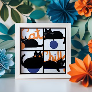
If your living room leans eclectic or you want one piece that anchors the whole wall, a single-subject statement cut reads as collected rather than mass-produced. The Magical Fox shadow box is one of MMA's best-selling templates because it carries a whole wall on its own — cut it in a restrained earth-tone palette (warm browns, soft charcoal, one quiet accent) and frame it deep in natural oak. For a cozier, lived-in living room, the Chill Cats shadow box reads as warm and characterful without going novelty. Both assemble at 8×8 and scale up; instant download, cuts clean on any Cricut or Silhouette.

Living Room Placement Ideas (Where Paper Art Actually Belongs)

Placement is the last lever — the same piece can look intentional or awkward depending on where in the room it lands. These are the placements I have hung and re-hung enough times to trust.
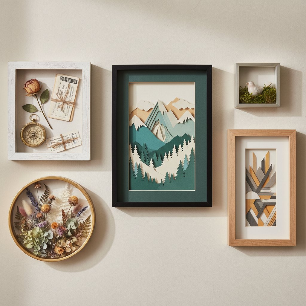
A gallery wall of diverse finished DIY shadow boxes including papercut art, keepsake, and floral displays

Above the sofa

The classic. One large statement piece, or a tight grouping, spanning 60–75% of the sofa width and hung 6–10 inches above the back. If you want flanking pieces, keep them clearly smaller and symmetric — two narrow verticals on either side of a central piece is a reliable arrangement. Resist the urge to fill the whole wall; the negative space above the grouping is what makes the art read as deliberate.

A gallery wall that mixes layered paper art with framed photos is one of the most living-room-native placements — it reads as collected over time. Keep the frame finishes consistent (all matte black, or all natural wood), hold spacing to a consistent 2–3 inches, and let one or two larger paper pieces anchor the arrangement with photos filling around them. The paper art supplies the depth the photos cannot.

Fireplace mantel

Prop a single layered piece on the mantel leaning against the wall (no hanging required), or hang a wide piece two-thirds of the mantel width a few inches above it. The mantel is one of the best spots for a seasonal swap — a different paper piece for each season refreshes the room without redecorating.

Reading nook

A smaller-scale paper botanical above a reading chair turns an unused corner into a destination. This is the spot for a 2–3 layer piece in a slim frame — you sit close to it, so the depth reads at arm's length.

Entryway-adjacent

If your living room opens onto an entry, a statement piece on the wall visible from the door sets the tone for the whole space. This is where a single, right-sized, bold piece earns its keep — it is the first thing anyone sees.

Integrating Paper Art With Your Existing Living Room Decor

The question I get most often is not "what paper art should I buy" — it is "how do I make paper art work with the canvas prints and framed photos I already have." The answer is texture-balance and color-harmony, not matching.
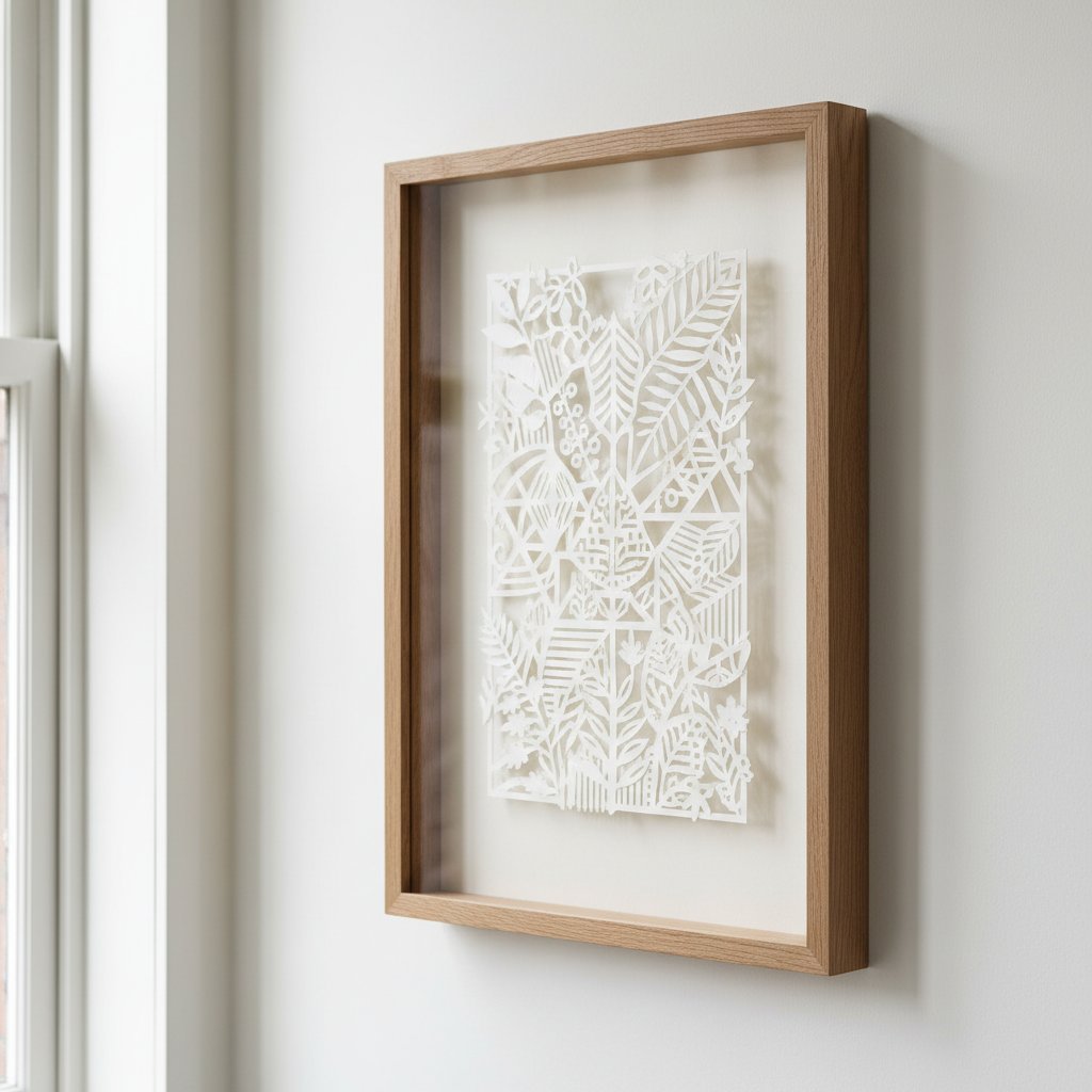
Intricate papercut art float-mounted in a deep glassless wooden frame on a neutral wall with no glass reflection

Mixing paper art with canvas prints

Canvas is flat and matte; layered paper is deep and shadow-catching. That contrast is a feature, not a problem — the two textures balance each other on a gallery wall. The one rule: keep the color story consistent across both. If your canvas print pulls from a navy and cream palette, cut your paper piece in the same navy and cream family so they read as a pair rather than two unrelated objects.

Combining with framed photos

Use similar frame profiles and mat colors so the frames disappear and the contents (photo vs. paper art) do the talking. Matching thin black or natural wood frames across a photo-and-paper gallery wall is the cleanest path; mismatched ornate frames read as clutter.

Layering with wall shelves

A layered paper piece works beautifully behind or between objects on a floating shelf — the shelf anchors it low on the wall and the objects in front add dimensional layering. Leave breathing room: one paper piece plus two or three shelf objects beats a crowded shelf with art crammed behind it.

Complementary materials

Wood accents, brass, ceramic, and textured wallcoverings all play well with paper. The one combination to watch is paper art directly next to a busy patterned wallpaper — if the wall behind is loud, the paper piece needs to be simpler (fewer layers, restrained palette) or it competes.

Avoiding visual clutter

The quickest way paper art stops working is overcrowding. A living room wall usually wants one statement moment — either one large piece, one tight gallery grouping, or one mantel prop. Adding a fourth and fifth scattered piece "just to try" is how a curated wall turns into a craft-fair booth. Edit ruthlessly.

Caring for Paper Art in a High-Traffic Living Room

Living rooms are the highest-traffic, most-lit room in the house, which means paper art there takes more abuse than paper art anywhere else. A few habits keep layered papercut looking intentional for years instead of months.
Framed paper art displayed away from direct sunlight to prevent fading

Keep it out of direct sun. UV fades cut cardstock within months and yellows white layers, which destroys the tonal contrast the whole piece depends on. Hang paper art on walls that get indirect light, or use UV-protective glass / acrylic if a sunny wall is your only option. The wall directly across from a south-facing window is the one to avoid.
Control humidity. Cardstock expands and warps in humidity — on a layered piece that warp is the first thing you see, because the crisp edge alignment that makes the depth read as "designed" goes wavy. Keep paper art out of the direct path of AC vents and away from humidifiers, and watch seasonal swings.
Dust shadow boxes gently. Deep frames trap dust. Every few months, take the piece down and dust the interior with a soft dry brush (a clean makeup brush works) before it builds up. Never spray glass cleaner near an unsealed paper piece.
Use glass for protection in busy rooms. In a living room with kids or pets, a shadow box behind glass or acrylic protects the cut layers from bumps and fingerprints while keeping the depth. For the no-glass float-mount look, accept that it is more fragile and place it higher.
Rotate seasonally rather than accumulate. The cleanest way to keep a living-room wall fresh is to swap one piece for another each season (a bare-tree winter cut, a botanical spring cut) rather than adding more pieces to the wall. One statement slot, rotated.

1.What size paper art should I hang above my sofa?
Aim for the piece (or grouped pieces together) to span roughly 60–75% of your sofa's width, with the bottom edge 6–10 inches above the top of the back. For an 84-inch sofa that means a grouped width of about 50–63 inches. Center the art on the sofa, not on the wall. The most common mistake is going too small — a single 12×12 above a full sofa reads as a postage stamp. When in doubt, size up or group multiple pieces.
2.Can I mix paper art with canvas prints in the same living room?
Yes — the flat matte texture of canvas balances beautifully with the depth and shadow of layered paper. The rule is color harmony, not material matching: keep both pieces inside the same color family (for example, a navy-and-cream canvas paired with a navy-and-cream paper cut) so they read as a coordinated pair. On a gallery wall, hold frame finishes consistent across both so the frames disappear and the contents do the talking.
3.Shadow box or flat paper art — which is better for a living room?
It depends on the job you want the art to do. Choose a shadow box (a deep, layered frame) when you want a single focal statement above a sofa or on a large wall — the real depth and shadow catch the light and hold the room. Choose flat paper art (a single cut layer, thin profile) when you want a sleek, modern, minimalist look, a gallery wall of several pieces, or you are working in a small living room where a deep frame would feel intrusive. Shadow boxes cost a little more to make; flat art runs cheaper and is easier to dust.
4.How do I protect paper art in a high-traffic living room?
Three controls: keep it out of direct sunlight (UV fades cardstock within months and yellows white layers — hang on indirectly-lit walls or use UV-protective glass), control humidity (cardstock warps in humid air and the warp shows immediately on layered pieces), and use glass or acrylic protection in rooms with kids or pets. Dust shadow box interiors gently with a soft dry brush a few times a year. Never spray cleaner near unsealed paper.
5.What paper art style works best for a small living room?
Minimalist layered designs in lighter colors create depth without overwhelming a small space. Use one right-sized statement piece rather than a busy grid, keep the palette to white-on-white, monochrome, or a single soft accent, and choose a thin-profile frame (matte black or natural oak) so the frame does not eat the wall. Flat paper art or a shallow 2–3 layer shadow box works better than a deep chunky frame in tight quarters — the depth still rewards the eye without protruding into the room.
6.Should living room paper art match my furniture or contrast it?
Either works — it is a deliberate choice. Matching (pulling a color from your sofa, rug, or throw into the paper palette) creates cohesion and calm, and is the safer move for restful rooms. Contrasting (a bold piece against a neutral wall, or a warm-toned piece against a cool palette) creates a focal point and energy. Pick based on what the room needs: a calm background or a statement moment. In either case, hold to a maximum of three colors in the paper layers so the piece stays readable.
7.How many pieces of paper art should I put in a living room?
One large statement piece, or three to five pieces in a single deliberate gallery wall arrangement. Avoid scattering individual small pieces around the room — that reads as clutter fast. A living room wall usually wants one statement moment: either one right-sized piece above the sofa, one tight gallery grouping, or one piece propped on the mantel. If you want variety, rotate one slot seasonally rather than adding more pieces to the wall.
8.How high should I hang paper art in a living room?
For a piece hung on an open wall (not above furniture), center the art so its midpoint sits at about 57 inches from the floor — the gallery-standard eye-level hanging height. Above a sofa, the bottom edge should sit 6–10 inches above the top of the back. Above a fireplace mantel, hang 3–6 inches above the mantel and no higher than 12 inches above it. Going too high is the second-most-common mistake after going too small — it disconnects the art from the furniture it relates to.