Articles10 min read

Minimalist Paper Wall Art for Modern Homes: How to Style Layered Papercut Pieces That Actually Look Minimal

The styling playbook for turning MMA's layered papercut shadow box templates into minimalist paper wall art — the neutral cardstock palettes, frame depths, and room placement rules I proved on my own living-room wall.

A finished layered paper shadow box of a blooming rose scene in a white frame on a shelf in daylight

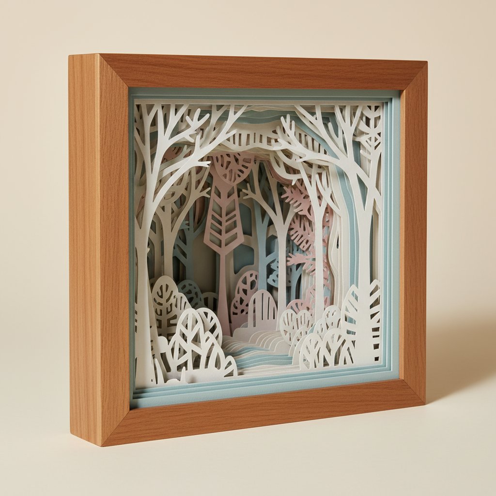
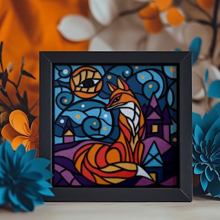
The first time I tried to put a layered papercut on a minimalist wall, I cut the Magical Fox template in seven colors — rust fur, emerald eyes, a gold moon, lavender trees — and framed it under glass. Technically it was a clean cut. On my calm white living-room wall it read as a toy. Every time I walked past, my eye snagged on it instead of resting. I took it down two weeks later and re-cut the same template in three warm greys on a soft charcoal back layer, float-mounted it in a natural oak shadow box, and hung it above a low mid-century console. Same template. Completely different wall. That second version is the one friends ask about — and it taught me the rule this whole article is built on: layered papercut reads as minimalist wall art the moment you control the palette, the depth, and the placement. The format does the work for you.

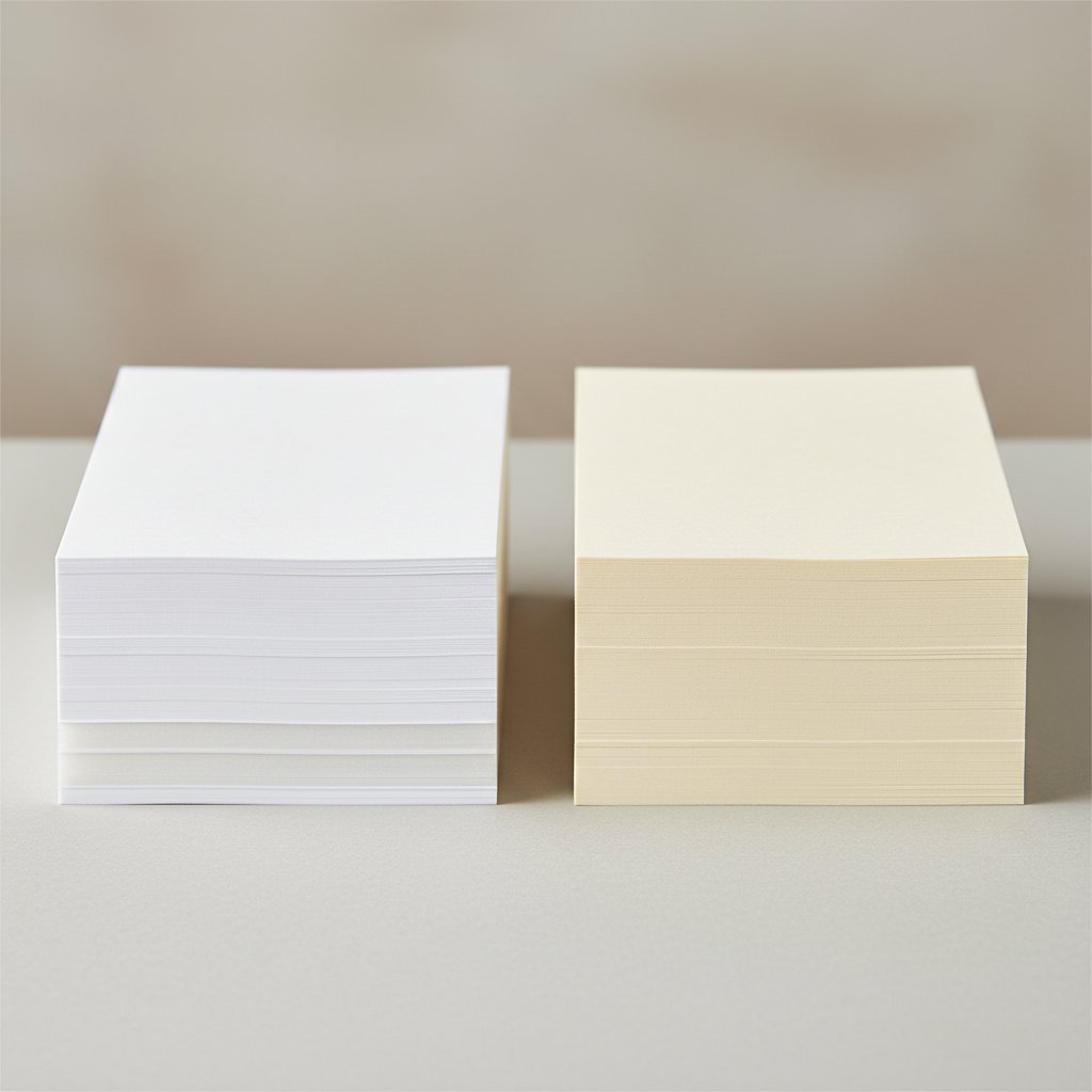
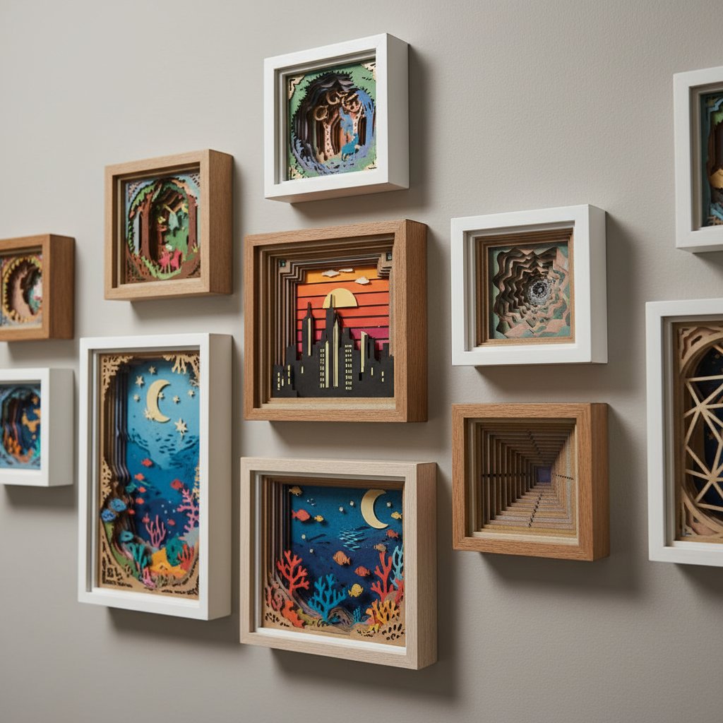
That matters because most people searching for minimalist paper wall art land on flat prints from big-box decor sites — pieces that are quiet but lifeless, with no texture and no depth. The underrated alternative is the layered paper shadow box: stack a few cut cardstock layers with spacers inside a frame and you get real, sculptural depth that a flat print physically cannot produce. Done in a restrained neutral palette, it reads as gallery minimalist art rather than craft — and because MMA sells ready-to-cut SVG templates for Cricut and Silhouette, you can produce that piece yourself for a few dollars of cardstock instead of commissioning it.

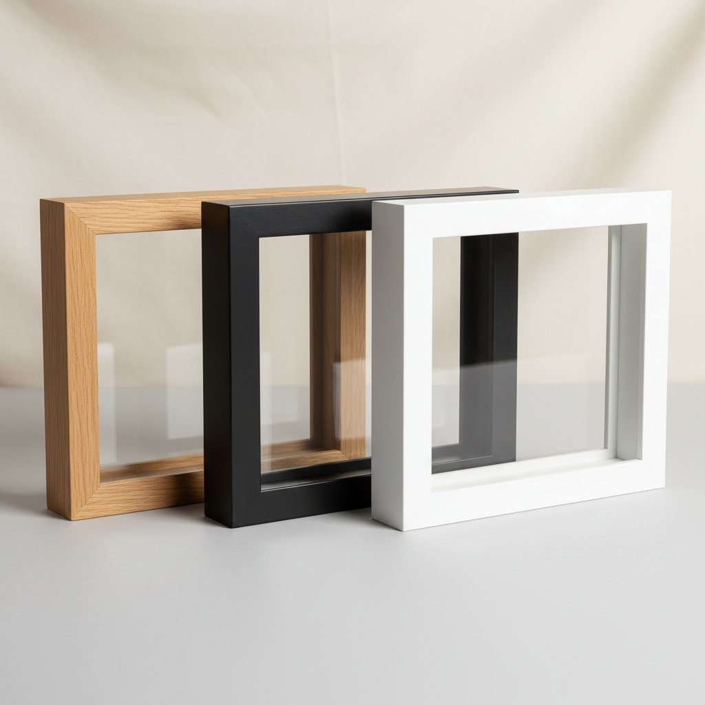
This is the styling and product bridge. If you want the underlying design principles (negative space, single focal subject, material honesty), our companion guide Minimalist Paper Wall Art: A Modern Home Design Guide covers those in depth — read it first if you are new to the look. If you want a shelf of different paper projects to choose from, DIY Paper Wall Art: 25 Projects for Every Room is the project library. This article is the one that tells you exactly which cardstock colors, frame depth, and wall each MMA template belongs on so the finished piece looks intentional in a Scandinavian, Japandi, or contemporary room.

Why Minimalist Homes Love Paper (Texture Without Noise)

Modern minimalist interiors — Scandinavian, Japandi, mid-century, contemporary — share one rule: few objects, each earning its place, against a backdrop of clean lines and natural light. The problem most minimalist wall art runs into is that flat prints are too quiet. A framed art print on a white wall can disappear into blandness. The room reads as sterile rather than restful, because there is nothing for the light to catch.

Layered paper solves exactly that. Stack three to five cut cardstock layers with foam spacers and every edge throws its own micro-shadow. Stand back and the piece reads as a single, calm sculptural object; step close and the depth rewards you. That is tactile texture inside a restrained palette — the thing minimalist rooms are starving for and flat prints cannot deliver.

A deep layered paper-cut shadow box viewed at an angle, paper layers receding into depth

There is a reason this format fits specific minimalist sub-styles so cleanly:

  • Scandinavian: pale woods, whites, and soft greys love a white-on-white or tone-on-tone
    layered cut. The depth stands in for the texture Scandi rooms get from textiles.
  • Japandi: the blend of Japanese restraint and Scandinavian warmth rewards single-subject
    cuts (one bloom, one branch, one architectural line) in warm whites, taupe, and soft black.
  • Contemporary / mid-century: crisp geometry and high contrast pair with monochrome
    (black-on-cream) layered cuts and thin black frames.

The catch — and this is the whole game — is that the same shadow box template can look minimalist or juvenile depending entirely on how you cut and frame it. That is what the rest of this article controls.

Single-Bloom Botanicals That Read Minimalist in Monochrome
The fastest path to a minimalist layered paper wall is a single botanical subject cut in one restrained color. Our lily, rose, and hydrangea shadow box SVG templates are built for this: each is one clean focal bloom, so the moment you cut it in white-on-warm-white or pale grey on charcoal, it reads as gallery minimalist art instead of craft. Download instantly, cut on any Cricut or Silhouette, and assemble at 8×8 inches or larger — no shipping, no wait, just the file and your cardstock.

The Minimalist Cardstock Palette Recipes

Palette is where a layered papercut flips from minimalist to busy. These are the four recipes I rely on, each tested on a real wall. The rule underneath all of them: one hue family, and at most one quiet accent.
Neat stacks of white and cream cardstock showing different paper weights side by side

White-on-white

Pure white layers on a warm-white or cream back layer. The warmth difference is what makes the cut readable — pure white on pure white disappears. This is the safest, most elegant minimalist palette and it works in every room. Use 65 lb warm-white cardstock for the cut layers and an 80 lb cream back layer for contrast that reads as depth, not color.

If you are chasing the minimalist wall art black and white search, this is your recipe: pale grey cut layers stepping down to charcoal, or a single black silhouette on cream. Two to four layers within the grey family read as sophisticated tone-on-tone — the dimensional version of a minimalist black-and-white print. For the full reasoning on why these pairings calm down, see our color theory guide for layered paper art.

Single-accent

An otherwise neutral piece (white, cream, or grey) with one muted accent color used in a single small area — one blush petal, one sage leaf, one thin copper line. Keep the accent under about 10% of the design or it stops reading as minimal. This is the recipe that lets a botanical template still feel modern in a Japandi room.

Japandi-neutral

Warm whites, taupes, soft sage, and soft black — the palette Japandi interiors are built on. Cut the whole piece from two or three tones within this family and it will sit on a natural-wood shelf like it was made for the room. Avoid pure black (too harsh) and any saturated color.

What to avoid

Three or more unrelated saturated colors, glitter cardstock, and metallics all push a layered piece from minimalist into craft-fair. The same template that looks sculptural in three warm greys looks like a toy in rust, emerald, and gold — I have the failed cut on my wall to prove it.

On a sparse wall the frame is half the piece, and for layered papercut the frame depth is non-negotiable — the layers need physical space to cast shadow. Get this wrong and the art compresses against the glass and loses the entire reason it is minimalist instead of flat.

Empty shadow box frames in natural wood, matte black and white finishes compared side by side

Match frame depth to layer count

As a working map: a 2–3 layer piece needs roughly ¾-inch to 1-inch of internal frame depth; 4–6 layers want 1–1.5 inches; anything 7+ layers wants a true shadow box at 1.5–2.5 inches deep. Too shallow and the back layers crush against the glass; too deep and a simple piece looks lost. Our frame size and depth guide for paper-cut shadow boxes has the exact measurements and the math behind them.

Matte black, natural oak, or float-mount — pick one and commit

For minimalist styling, three frame finishes work and the rest do not. A thin matte black frame sharpens a monochrome cut and reads as deliberate. A flat natural-oak or ash frame ties the piece to the wood tones in Scandi and Japandi rooms. A deep, glassless float-mount frame is the gallery choice — it leaves the cut edges and layered shadow fully exposed with no reflection. For the no-glass method end to end, see how to frame paper art without glass.

Matting and grouping

A wide off-white mat (3 inches or more) gives a small minimalist piece presence on a large wall — the mat does the work that negative space does in the design. If you group pieces, keep frames identical and leave 3–4 inches between them so each piece still reads individually. One large statement piece almost always beats a busy grid on a minimalist wall.

Abstract and Architectural Line Work for Contemporary Walls
For a mid-century or contemporary minimalist wall, abstract and architectural cuts bring structured energy without any color at all. The Mind Tree template reads as a contemplative single-subject piece; the Seaside Houses template captures clean architectural line work that suits a neutral, modern room. Cut either in a single warm-white or soft-grey tone, drop them in a thin black or natural-oak frame, and you have a minimalist statement piece you made yourself. Instant SVG download, Cricut- and Silhouette-ready.

Room-by-Room Minimalist Placement

Minimalist placement is an editing decision: one right-sized piece usually beats a cluster, and the wall around the art matters as much as the art. These are the placements I keep coming back to. (For a wider menu of paper projects by room, our DIY paper wall art home decor guide is the library; use it for inspiration, then come back here for the minimalist restraint rules.)

A growing collection of handmade layered paper-cut shadow boxes on a gallery wall

Living room

One large statement piece above the sofa, spanning roughly two-thirds to three-quarters of the sofa's width, bottom edge 6–10 inches above the back. A white-on-white or monochrome layered cut in a natural-oak frame is the safest gallery-minimalist move. Resist the urge to flank it with smaller pieces — the negative space is the point.

Bedroom

Calming monochrome above the bed: a single bloom or a single architectural line, framed thin and hung so the center sits about 57–60 inches from the floor. This is the room where the single-accent palette earns its keep — one muted tone reads as restful, not flat.

Entryway and hallway

Narrow vertical pieces or a restrained pair. These are the spaces where a 2–3 layer tone-on-tone cut in a slim frame punches above its size, because you are walking past it at close range and the depth is what you notice.

Home office

Linear, architectural, or geometric subjects suit the focus of a workspace. The Seaside Houses or Mind Tree templates in soft grey on charcoal, framed matte black, read as considered and modern without competing for attention while you work.

From "Minimalist Wall Art" Search to Something You Made

Here is the bridge. If you searched minimalist paper wall art or minimalist wall art for living room, the SERP you hit is almost entirely flat prints from big decor retailers — quiet, but textureless and mass-market, with nothing about them that is yours. The layered papercut shadow box is the format that does what those prints cannot: real depth, real shadow, real handmade texture, inside the same restrained minimalist palette.
And because MMA sells digital SVG templates rather than finished art, the math flips in your favor. One template (a few US dollars, instant download) plus a handful of 65 lb cardstock sheets and one shadow-box frame produces a gallery-quality minimalist piece — the same piece a commissioned framer would charge ten to twenty times more to make. You cut it on your own Cricut or Silhouette, you choose the exact neutral palette your room needs, and you assemble it at the size your wall actually wants. No shipping, no wait, no guesswork about whether it will match the room — because you controlled every layer.
That is the real case for making minimalist paper wall art instead of buying it: the piece on your wall is calibrated to your room, in your palette, at your scale, for the cost of cardstock. Browse the full shadow box SVG collection and pick a single-subject template that matches your minimalist sub-style — botanical for Japandi, architectural for contemporary, geometric for mid-century.

The Best-Seller That Styles Minimalist When You Cut It Right
The Magical Fox shadow box is one of MMA's best-selling templates for a reason — but the version that reads minimalist is the restrained one. Cut it in three warm greys on a soft charcoal back layer (skip the saturated rusts and emeralds), frame it in natural oak or matte black at 1–1.5 inches deep, and the same template that looks whimsical in full color reads sculptural and modern. Instant download, cuts clean on any Cricut or Silhouette, assembles at 8×8 inches or larger.

Caring for Minimalist Paper Art (So It Stays Minimal)

Minimalism is unforgiving — there is nowhere for damage to hide. A faded or warped minimalist piece reads worse than a busy one because nothing distracts the eye. A few habits keep layered papercut looking intentional for years.
Keep it out of direct sun. UV fades cut cardstock within months and yellows white layers, which destroys the tone-on-tone contrast the whole minimalist palette depends on. Hang on walls that get indirect light, or use UV-protective glass if a sunny wall is your only option. Our guide to preserving paper art from fading goes deeper.
Control humidity. Cardstock expands and warps in humidity, and on a minimalist piece that warp is the first thing you see — the crisp edge alignment that makes layered depth read as "designed" turns wavy. Avoid bathrooms and kitchens, and watch seasonal swings. See our notes on humidity and weather impact on paper cutting.
Dust glassless pieces gently. For float-mounted pieces with no glass, use a soft dry brush (a clean makeup brush works) every few months. Never spray cleaner or use water near cut paper.
Rotate, do not accumulate. The quickest way a minimalist wall stops feeling curated is adding a fourth and fifth piece "just to try." Keep one statement piece, and when you want a change, swap it for a different template in the same palette rather than stacking more on the wall.

1.Is layered paper art actually minimalist, or just craft?
It depends entirely on palette and framing — not the format. A layered papercut shadow box cut in white-on-white, monochrome greys, or a single-accent neutral palette and float-mounted in a deep, simple frame reads as sculptural minimalist art. The same template cut in three or more saturated colors reads as craft. Layered paper gives you the depth flat minimalist prints cannot; restraint in color is what keeps that depth reading modern.
2.What are the best cardstock colors for a minimalist layered paper wall?
Four palettes work reliably: white-on-white (pure white cut layers on a warm-white or cream back layer), monochrome (pale grey stepping to charcoal, or black on cream), single-accent (neutral base plus one muted color used in under 10% of the design), and Japandi-neutral (warm whites, taupe, soft sage, soft black). Avoid combining three or more unrelated saturated colors, glitter, and metallics — those push a piece from minimalist into juvenile.
3.What shadow-box frame depth do I need for a 5-layer minimalist cut?
For a 4–6 layer piece, aim for roughly 1 to 1.5 inches of internal frame depth so the back layers have room to cast shadow without compressing against the glass. A 2–3 layer piece wants about ¾ to 1 inch; 7+ layers want a true shadow box at 1.5 to 2.5 inches deep. Too shallow crushes the depth; too deep makes a simple piece look lost. Our frame size and depth guide has exact measurements.
4.Can minimalist paper wall art work in a small apartment?
Yes — small apartments are where layered paper shines, because it delivers texture and depth without the footprint of a chunky canvas. Use one right-sized statement piece rather than a busy grid, keep the palette to white-on-white or monochrome, and choose a thin frame (matte black or natural oak) so the frame does not eat the wall. In tight entryways and hallways, a single narrow vertical 2–3 layer tone-on-tone cut punches well above its size.
5.How do I keep my minimalist papercut from looking childish?
Three controls fix it. First, restrict the palette to one hue family (white-on-white, monochrome, or Japandi-neutral) with at most one quiet accent under 10% of the design. Second, frame it in a deep, simple frame — matte black, natural oak, or glassless float-mount — never a chunky ornate or collage frame. Third, place one right-sized piece with generous negative space around it rather than clustering. The Magical Fox template cut in three warm greys reads sculptural and modern; the same template in rust, emerald, and gold reads like a toy.
6.Why make minimalist paper wall art from an SVG template instead of buying a print?
Because the layered papercut format gives you real dimensional depth and shadow that a flat minimalist print physically cannot produce — and because MMA sells digital SVG templates, you get that gallery-quality piece for the cost of one template (a few US dollars, instant download) plus cardstock and a frame. You also control the exact neutral palette, the scale, and the frame depth, so the finished piece is calibrated to your room rather than picked off a shelf. No shipping, no wait — you cut it on your own Cricut or Silhouette.
7.Which MMA templates suit a Scandinavian or Japandi minimalist room?
Single-subject templates read most minimalist in restrained palettes. For Japandi, the lily, hydrangea, and rose botanical shadow box templates cut in warm-white or single-accent neutral tones work well. For Scandinavian and contemporary rooms, the Mind Tree and Seaside Houses papercut templates bring clean linear or architectural energy that suits a neutral, modern wall. Cut any of them in one hue family, frame in natural oak or matte black, and place one statement piece with negative space around it.