Articles13 min read

Minimalist Paper Wall Art: A Modern Home Design Guide

Five design principles and six project types for minimalist paper wall art that actually belongs in a modern home — the framing, palette, scale, and placement rules I learned by overdressing a wall, stripping it back, and starting over.

Intricate papercut art float-mounted in a deep glassless wooden frame on a neutral wall with no glass reflection

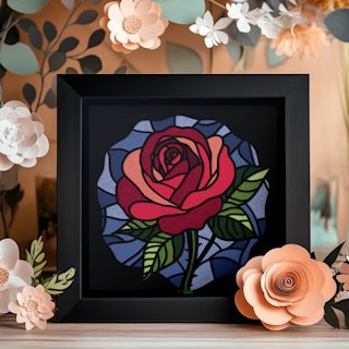
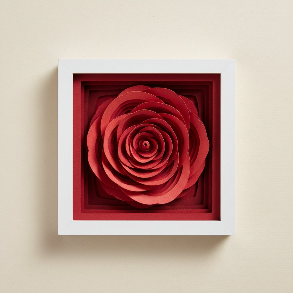
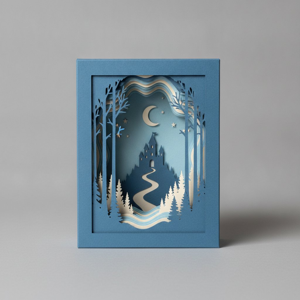
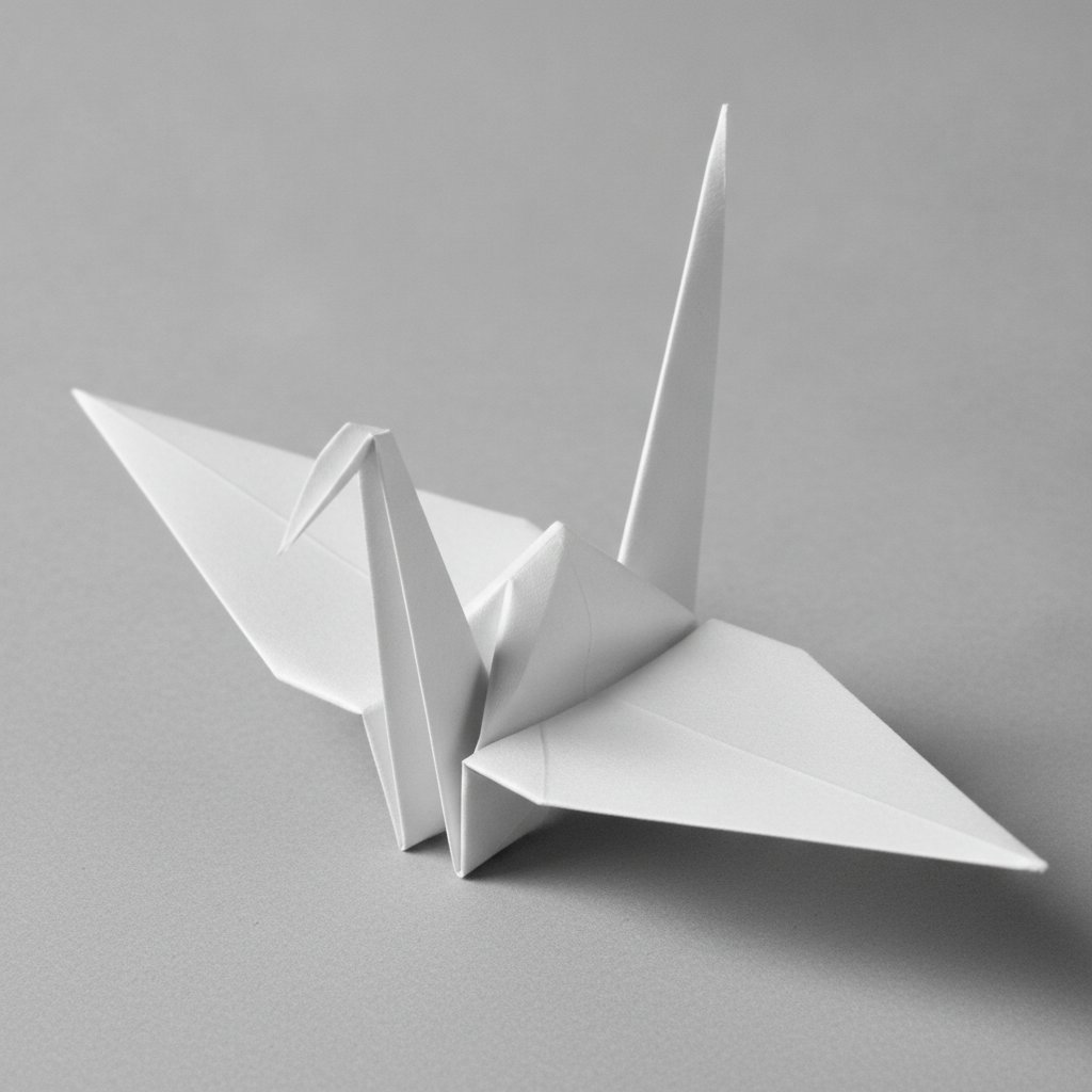
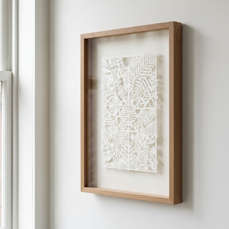
The first paper piece I hung in my living room was an eight-color layered shadow box, packed with detail, glowing with LEDs, and crammed into a chunky black frame. It was technically impressive. It was also loud. On a calm white wall it read as visual noise — every time I walked past, my eye had nowhere to rest. Three weeks later I took it down and hung a single white papercut rose in a float-mounted frame instead. The room finally felt like the modern, quiet space I had been aiming for. That swap taught me everything I know about minimalist paper wall art.

Minimalist paper wall art is not about owning less for its own sake. It is about choosing paper pieces that earn their place on the wall — single subjects, honest materials, restrained palettes, and proportions that respect the room around them. Done well, paper art becomes the calm focal point a modern home needs instead of another thing competing for attention.

This guide distills what I have learned hanging (and removing) paper art in my own home and studio over the past four years. You get the five design principles that separate a restful minimalist wall from a stark or sterile one, six project categories you can actually make or buy, and the framing, palette, scale, and care rules that keep minimalist paper pieces looking intentional rather than unfinished.

If you are newer to cutting paper yourself, our how to make paper cut art beginner's guide covers the basic techniques; this article focuses on the design and display decisions that make minimalism work.

Why Minimalist Paper Wall Art Belongs in a Modern Home

Modern interiors lean toward clean lines, natural light, and a few well-chosen objects rather than crowded surfaces. Paper art fits that brief better than almost any other medium, for three reasons I keep coming back to.

Paper is quiet by nature. A single sheet of cut or folded paper catches light and shadow without shouting. Where a bold oil painting or a busy gallery-wrapped canvas demands attention, a minimalist papercut invites a longer, slower look. That calmness is exactly what a bedroom, hallway, or living room in a contemporary home is asking for.

It carries real texture. The best minimalist decor is never flat and sterile — it relies on subtle material contrast. Cut paper has crisp edges and soft shadows; layered paper has genuine depth you can see from across a room. That tactile quality lets a minimalist piece add interest without adding clutter.

It scales to the wall you have. Because paper art is lightweight and easy to frame, you can size a single piece to fill a statement wall or keep it small for a reading nook. You are never forced into an off-the-shelf canvas dimension that fights your furniture.

A papercut silhouette float-mounted in a deep glassless wooden frame on a neutral wall

There is a catch, though. Minimalism exposes every decision. When you strip a wall down to one piece, that piece has to be right — the subject, the frame, the scale, the palette all get amplified. The five principles below are how I keep those decisions working in my favor.

Five Design Principles for Minimalist Paper Wall Art

These are the rules I run every paper piece through before it earns wall space. They are not about style preference — they are about why one minimalist piece feels restful and another feels empty or cold.

1. Restraint over abundance

The defining move of minimalist paper wall art is leaving negative space alone. A papercut that uses 40% of the frame and lets the other 60% breathe will always read as more intentional than one that fills every inch. Before I commit to a design, I ask: what would this look like if I removed a third of the elements? If the answer is "better," I remove them. Negative space is the active ingredient in minimalism — treat it as a material, not a void.

2. One focal subject per piece

Minimalism asks the eye to land somewhere specific. A single rose, one crane, a lone tree line — one clear subject lets the viewer rest. When a paper design has two or three equal focal points, the eye darts between them and the calm disappears. If you love a busier composition, save it for a maximalist room; on a minimalist wall, one subject wins.

3. A limited, considered palette

One color, or two colors max, is the sweet spot for minimalist paper art. Monochrome (white on white, black on cream, a single dusty tone) is the safest and most elegant starting point. If you add a second color, make it an accent — a pale background with a single muted hue reads as considered; three or more colors read as a pattern collection. For the full reasoning behind pairing paper colors, see our color theory guide for layered paper art.

4. Material honesty

Let paper look like paper. Minimalism celebrates what a material actually is, so the worst thing you can do is dress paper up to imitate something else — glossy coatings, heavy digital prints over a cut, busy backgrounds that hide the cut edges. Instead, choose acid-free paper with a visible grain, let cut edges stay crisp and unembellished, and let the natural shadow of layered paper do the work that glitter and foil would otherwise try to do.

5. Proportion before decoration

A perfectly minimalist papercut in the wrong size still looks wrong. Proportion is the principle most people skip and the one that matters most on a bare wall. Two rules I never break: a single piece should fill roughly two-thirds to three-quarters of the wall width above a piece of furniture (a sofa, a bed, a console), and the bottom of the frame should sit 6 to 10 inches above that furniture. Get the size right first; everything else is finishing.

Single-Flower Silhouettes for a Minimalist Wall
A single bloom cut in one color is the easiest minimalist paper piece to start with — one focal subject, one palette, instant calm. Our rose, lily, and hydrangea shadow box templates cut clean in any single paper color you choose. Cut them in white on white or pale gray for a true minimalist look.

Six Project Categories for Minimalist Paper Wall Art

Once the principles are clear, the question becomes: what should I actually make or buy? These six categories cover the range of minimalist paper wall art I see working in modern homes. Each leans on the principles above in a slightly different way, so pick the category that fits the wall and the room rather than the one that looks impressive in a photo.

Category 1: Monochrome silhouette papercuts

A single subject — one flower, one leaf, one animal profile — cut from a single sheet in one color. This is the purest expression of minimalist paper art and the category I recommend most often. The rose silhouette I swapped onto my living room wall is exactly this: one flower, one color, one frame. It works above a sofa, beside a bed, or as a quiet piece in an entryway. The only skill required is a clean cut; the design does the rest.
A single layered paper-cut rose silhouette in a square frame

Category 2: Continuous line-art papercuts

Line-art papercuts reduce a subject to a single flowing cut line — a face in profile, a botanical outline, an architectural sketch. Because the entire image is one connected path, there is no filling, no layering, no color. The result reads as a drawn line that happens to be cut from paper. This category is ideal for Scandi and Japandi interiors, where a thin black line on warm white is a signature look.

Category 3: Single-color layered shadow box

Layered paper art is normally maximalist — five to nine layers of saturated color. But the same technique, done in a single color with subtle tone-on-tone layering (pale gray to charcoal, or warm white to cream), becomes deeply minimalist. The depth stays; the noise goes. I built a three-layer tone-on-tone tree line in grays for a hallway and it is the most-asked-about piece in my home. Use two to four layers max and keep each layer within the same hue family.

Category 4: Geometric and mandala papercuts

Geometry is inherently ordered, which is why a single geometric papercut or a restrained mandala sits comfortably on a minimalist wall. The key is scale and count: one large mandala as a focal piece reads as meditative, while a grid of six small ones starts to read as a collection. For a minimalist room, choose one large geometric piece over the sofa or bed, in a single color, and let the symmetry do the talking.
A simple assembled papercut shadow box made from a few paper layers showing modest depth

Abstract and Architectural Line Work
For a contemporary minimalist wall, abstract and architectural papercuts bring structured energy without color. The Mind Tree template reads as a contemplative single-subject piece; the Mediterranean seaside houses template captures clean architectural line work that suits a neutral, modern room. Both cut beautifully in a single paper tone.

Category 5: Single origami form, float-mounted

One origami crane, one folded leaf, one structured geometric fold — mounted alone in a deep frame — is a classic minimalist statement with a Japanese design sensibility. The single form becomes a sculptural object rather than a picture. I keep a single white crane in a float frame on a bedroom wall and it has stayed there for two years without feeling stale. The discipline here is restraint: one form, generous surrounding space, a frame deep enough to show the folds casting real shadow.
A single crisply folded white paper crane showing sharp clean creases

A minimalist gallery wall is not an oxymoron — it is a grouping of three to five small pieces with deliberate negative space between them, unified by palette or subject. The mistake people make is treating "gallery wall" as a license to fill every inch. Instead, treat it as three to five solo pieces having a quiet conversation. Keep frames identical, keep the palette tight, and leave at least 3 to 4 inches between frames so each piece still reads individually.

Minimalist Palettes That Actually Work

Palette is where minimalist paper art lives or dies. These are the four palettes I rely on, each tested on real walls.

White on white. Pure white paper cut on a warm white or cream background. The subtle warmth difference is what makes the cut readable — pure white on pure white disappears. This is the safest, most elegant minimalist palette and works in every room.

Black on cream. A single black papercut on a cream or ivory backing. High contrast but still calm, because there is only one mark-making color. This is the palette that reads most "designed" and photographs beautifully.

Tone on tone. Two or three layers within one hue family — pale gray to charcoal, blush to rose, sage to forest. The depth reads as sophistication rather than decoration. Best for layered shadow box pieces (Category 3).

Single accent. An otherwise neutral piece (white, cream, or gray) with one restrained accent color used in a single small area — a single muted petal, a thin line. The accent should occupy less than 10% of the piece or it stops reading as minimal.

One rule overrides all of this: test the palette in the actual room, under the actual lighting, before you commit. A palette that looks perfect in daylight can read flat or cold under warm evening bulbs.

Framing Minimalist Paper Art

Framing makes or breaks minimalist paper wall art — on a sparse wall, the frame is half the piece. These are the frame choices I trust.

Float-mount in a deep, glassless frame. This is my default for cut paper. The paper sits raised inside a deep frame with no glass, so the cut edges and layered shadow are fully visible. It reads as gallery-quality and suits every minimalist category above. For the full method, see our guide on how to frame paper art without glass.

Thin black or charcoal frame. A slim black frame around a black-on-cream papercut sharpens the contrast and reads as deliberate. Keep the frame profile narrow — under an inch — so it does not overpower a single delicate cut.

Natural wood frame. Oak, ash, or walnut in a simple flat profile warms up a minimalist piece and ties paper art to the wood tones in Scandi and Japandi rooms. Avoid ornate or distressed wood; the profile should be clean and flat.

Mat board with generous margins. A wide mat (3 inches or more) gives a single small piece presence on a large wall. The mat does the work that negative space in the design does — it lets the subject breathe. Keep mat color to white, off-white, or cream.

Skip the chunky ornate frames, multi-opening collage frames, and anything metallic or mirrored. They fight the quietness that makes minimalist paper art work in the first place.

Calm Nature Pieces for a Minimalist Grouping
Building a restrained gallery wall or want one quiet statement piece? Our calm nature templates — a pair of resting cats and a single fox in soft silhouette — cut beautifully in a single neutral tone. Each is a single focal subject that holds its own on a minimalist wall.

Sizing and Placement Rules

Proportion is the most underused minimalist tool. Get it wrong and even a beautiful piece looks awkward; get it right and a simple piece looks intentional. These are the rules I apply every time.

Above furniture, fill two-thirds to three-quarters. A piece above a sofa, bed, or console should span roughly 60 to 75% of the furniture's width. Smaller reads as lost; larger reads as crowding. For a 84-inch sofa, aim for a piece (or tight grouping) about 50 to 63 inches wide.

Hang at eye level, not ceiling height. The center of the piece should sit about 57 to 60 inches from the floor — standard gallery height. Above furniture, drop the bottom edge to 6 to 10 inches above the furniture. Hanging too high is the most common minimalist mistake and it makes a wall feel sparse and accidental.

On a bare wall, go big or go grouped. A single small piece on a large empty wall looks stranded. Either commit to one large piece (24x36 or bigger for a statement wall) or gather three to five small pieces into the restrained gallery wall from Category 6.

Leave breathing room around the piece. Whatever you hang, keep at least 6 inches of clear wall on every side. Minimalism depends on the empty wall around the art as much as the art itself.

Caring for Minimalist Paper Wall Art

Paper is a fragile medium, and minimalism gives it nowhere to hide. A faded or warped minimalist piece reads worse than a busy one because there is nothing to distract the eye. A few habits keep minimalist paper art looking crisp.

Keep it out of direct sun. UV fades cut paper within months and yellows white paper. Hang on walls that get indirect light, or use UV-protective glass if a sunny wall is your only option. Our guide on how to preserve paper art from fading goes deeper on this.

Control humidity. Paper expands and warps in humidity, which on a minimalist piece is immediately visible. Avoid bathrooms and kitchens unless the piece is sealed behind glass with a closed back. Stable indoor humidity keeps cut edges flat.

Dust gently. For glassless float-mounted pieces, use a soft dry brush (a clean makeup brush works) to dust every few months. Never use water, spray cleaners, or compressed air — all three can warp or loosen cut paper.

Use acid-free everything. Acid-free paper and acid-free backing board prevent the yellowing and embrittlement that ruins paper art over years. For a piece you want to keep long-term, this is the single most important material choice.

Common Minimalist Mistakes and How to Fix Them

Minimalism is unforgiving, so the same few mistakes show up again and again. Here are the ones I see most and how I correct them.

The piece is too small for the wall. A lonely 8x10 above a king bed reads as an accident. Fix: size up to one large piece, or group three pieces into a restrained gallery wall that spans two-thirds of the bed width.

Too many subjects on one piece. A papercut with a flower, a bird, and lettering has no focal point and the calm evaporates. Fix: choose one subject per piece and let the others become their own separate pieces if you love them.

The frame is too heavy. A delicate white papercut in a 3-inch ornate gold frame is unbalanced. Fix: match frame weight to the cut — thin and simple for delicate cuts, natural wood for warmth, float-mount for depth.

Hanging too high. The piece floats near the ceiling and the wall below feels empty. Fix: drop it so the center sits at 57 to 60 inches, or 6 to 10 inches above the furniture.

Conflicting palettes across a room. A white-on-white piece next to a saturated rainbow shadow box makes both look wrong. Fix: commit to one palette family per wall, or per room if you can see multiple pieces at once.

Mistaking "empty" for "minimalist." A bare wall with one tiny piece is not minimalism — it is unfinished. Fix: either commit to a properly sized single piece, or build the restrained grouping the wall actually needs.

1.What makes paper wall art "minimalist"?
Minimalist paper wall art follows five principles: restraint (generous negative space), one focal subject per piece, a limited palette of one or two colors, material honesty (letting paper look like paper rather than imitating another medium), and proportion that fits the wall. A single papercut rose in one color on a white wall is minimalist; an eight-color layered shadow box is not. Minimalism is an editing decision, not a style preference.
2.What size minimalist paper art should I hang above a sofa?
A single piece (or a tight grouping) should span roughly two-thirds to three-quarters of the sofa's width. For an 84-inch sofa, that means about 50 to 63 inches wide. Hang the bottom edge 6 to 10 inches above the sofa back, with the center of the piece around 57 to 60 inches from the floor. Smaller pieces look stranded; larger pieces crowd the furniture.
3.What frame works best for minimalist paper art?
A float-mount in a deep, glassless frame is the most gallery-like choice and shows cut edges and layered shadow clearly. Thin black frames sharpen black-on-cream cuts, simple natural wood (oak, ash, walnut) warms up Scandi and Japandi rooms, and a wide mat board gives a small piece presence on a large wall. Avoid chunky, ornate, mirrored, or collage frames — they fight the quietness minimalist paper art depends on.
4.Can layered paper shadow boxes be minimalist?
Yes, if you use a single color with subtle tone-on-tone layering. Instead of five to nine saturated layers, use two to four layers within one hue family — pale gray to charcoal, or warm white to cream. The dimensional depth stays, but the visual noise goes. This is one of the six minimalist project categories and works especially well in hallways and entryways.
5.Is a minimalist gallery wall a contradiction?
No. A restrained gallery wall is three to five small pieces with deliberate negative space between them, unified by palette or subject. The mistake is treating "gallery wall" as a license to fill every inch. Keep frames identical, keep the palette tight (one or two colors), and leave at least 3 to 4 inches between frames so each piece still reads individually rather than merging into a busy grid.
6.How do I keep minimalist paper art from fading?
Keep pieces out of direct sunlight, which fades cut paper within months and yellows white paper. Hang on walls that receive indirect light, or use UV-protective glass if a sunny wall is unavoidable. Use acid-free paper and acid-free backing board to prevent long-term yellowing and embrittlement, and control humidity to keep cut edges flat. Dust glassless pieces gently with a soft dry brush every few months.
7.What color palette should I start with?
Start with white-on-white (pure white paper on a warm white or cream background) or black-on-cream. Both are the safest and most elegant minimalist palettes and work in every room. Once you are confident, try tone-on-tone layering (two or three shades within one hue) or a single neutral piece with one small accent color occupying under 10% of the design. Always test your palette under the room's actual lighting before committing.
8.Can I hang minimalist paper art in a bathroom or kitchen?
Only with precautions. Humidity makes paper expand, warp, and loosen, which on a minimalist piece is immediately visible. If you must, frame the piece behind glass with a sealed back, keep it away from direct steam (not above a shower or stove), and use acid-free archival materials. Monitor the piece — if you see warping or curling, move it to a drier room.
9.What is the difference between minimalist and just-empty wall decor?
Minimalism is an intentional editing choice: a properly sized piece, a considered frame, a limited palette, and proportion that fits the wall and furniture. An empty wall with one tiny stranded piece is not minimalist — it is unfinished. The test is whether the wall feels calm and considered. If it feels accidental or sparse, you usually need a larger single piece or a small, tight grouping rather than less.