Articles13 min read

Art Gallery Ideas: How to Build Museum-Worthy Displays with Layered Paper Shadow Boxes

Fresh art gallery ideas built from layered paper shadow boxes — depth-aware layout formulas, color stories, and light strategy for dimensional DIY paper art that flat prints cannot match.

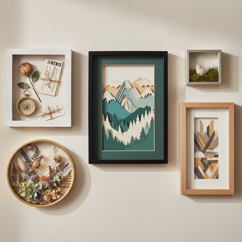
Gallery wall of diverse finished DIY shadow boxes including papercut art keepsake and floral displays

Art Gallery Ideas: How to Build Museum-Worthy Displays with Layered Paper Shadow Boxes

Last spring I cleared a 12-foot living-room wall and set myself one rule: no flat prints. Instead I arranged five layered paper shadow boxes — a Hydrangea, a Lily, a Rose, a set of Seaside Houses, and a Magical Fox — into a single cohesive gallery. The wall I had stared at for two years suddenly moved. By mid-afternoon the cut layers threw real shadows that lengthened and softened as the sun crossed the window, and by evening, with a warm-white LED behind each frame, the whole arrangement glowed like a lit museum case. Three separate visitors asked which studio I had bought them from. None of them believed I cut the layers myself on a Cricut.

That installation is what convinced me that most art gallery ideas miss the point. The dominant advice online — from Pinterest boards to decor blogs — treats a gallery wall as a flat surface: a grid of prints and photographs arranged by size and color. Layered paper shadow boxes turn the wall into something dimensional. Depth, shadow, and shifting light make the display feel alive rather than static, and the make-it-yourself path is far more affordable than a single framed print from a retailer.

This guide is the curation playbook I wish I had before that first wall. It covers depth-aware layout formulas, color stories that hold across multiple pieces, the light-and-shadow strategy unique to dimensional paper, thematic storytelling through template selection, and the technical installation details — spacing, height, and hardware — that separate a cluttered wall from a curated one. If you need individual projects to cut first, start with our DIY paper wall art guide, then come back here to arrange them.
A standard gallery wall is, mechanically, a collection of flat things on a flat surface. Prints, posters, and photographs catch light the same way a sheet of paper does — evenly, with no variation as you walk past. The eye reads them quickly and moves on. This is why so many curated gallery walls, despite careful color coordination, still read as "decor" rather than "art."

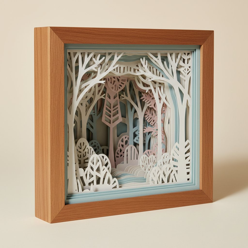
Layered papercut shadow boxes break that flatness. Each piece is built from five to ten precision-cut cardstock layers stacked with foam spacers inside a deep frame. The result is real, physical depth — usually half an inch to an inch and a half between the front layer and the back. That depth does three things a flat print cannot:

  • It casts shadow. The raised edges of each layer block light and throw soft shadows onto the layers behind them, giving the piece natural contrast without any ink.
  • It shifts with your viewing angle. Walk past a layered piece and the visible depth recomposes; the scene has parallax, the way a diorama does.
  • It reacts to changing light. Morning sun, overcast afternoon, and warm evening LEDs each pull a different mood out of the same cut layers.
Deep layered paper-cut shadow box viewed at an angle showing paper layers receding into depth

The practical takeaway is simple but easy to undervalue: when you design a gallery around dimensional pieces, you are designing for time, not just for space. The wall in my living room looks different at 9 a.m. than it does at 4 p.m., and different again after dark. A flat-print gallery wall, however well-arranged, looks the same in every light and at every hour.

A gallery fails for one of two reasons: the pieces fight each other, or the arrangement ignores the wall's shape. These five formulas cover almost every domestic wall I have worked with. Pick the one that matches your wall first, then choose the art to fill it.

1. Linear symmetry (the confident row)

Evenly spaced identical frames in a single horizontal line. Best on long, uninterrupted walls — above a sofa, a console table, or a hallway runner. Use five to seven matching frames for the cleanest read. Linear symmetry reads as deliberate and architectural; it is the safest formula for a first gallery.

2. Grid balance (the museum block)

A strict 2×3 or 3×3 grid of identical frames. Best on large open walls with no furniture in front of them. The grid is the most "gallery" of the layouts — it reads as a curated collection. Keep frame sizes and mat widths identical; let the art inside vary.

3. Asymmetrical cluster (the organic grouping)

Three to seven frames of mixed sizes arranged around an imaginary center, with edges intentionally uneven. Best above furniture — a bed, a sideboard, a low bookshelf — where the cluster can lean visually toward the taller furniture side. This is the formula that absorbs a dimensional hero piece most gracefully.

4. Vertical column (the hallway solution)

Two to four frames stacked vertically with tight, even spacing. Best in narrow vertical spaces: the strip of wall beside a doorway, a stairwell landing, or between two windows. Vertical columns draw the eye up and make low ceilings feel taller.

5. Focal-point anchor (the statement wall)

One large piece — usually 12×12 inch or bigger — flanked by two to four smaller works that echo its palette or theme. Best when you have a single piece you want to feature. The smaller pieces frame the anchor without competing with it.

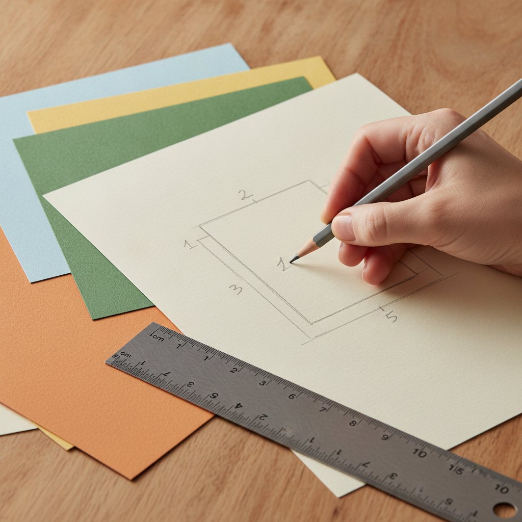
A hand sketching a numbered layer-stack layout plan with a pencil beside sheets of cardstock and a ruler

Whichever formula you choose, lay it out on the floor first. I trace each frame's outline on kraft paper, cut out paper templates, and tape them to the wall with painter's tape for a full day before I put a single nail in. Template-mocking the wall has saved me from at least three bad spacing decisions I would otherwise have committed to permanently.

Anchor Your Gallery With Botanical and Coastal Templates
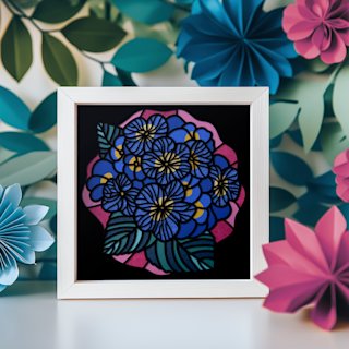
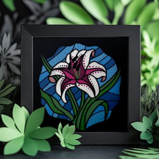
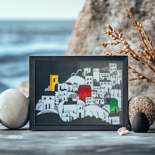
These ready-to-cut SVG templates are built for gallery grouping — the Hydrangea and Lily anchor a nature palette while the Seaside Houses carry a coastal or monochrome wall. Instant download, layered SVG, and tested Cricut cut settings on every file.

Designing a Color Story Across Multiple Pieces

A gallery holds together visually when its pieces share a deliberate color logic. The mistake I see most often is "matchy" — five frames in the identical shade of blue, which reads flat and retail. The far stronger move is a story: a progression or a restrained accent that lets each piece contribute something the others do not.

Four color stories cover most homes:

  • Monochrome progression. A single hue shifting in value across the wall — charcoal to slate to dove grey, or warm white through cream to sand. Each piece is quieter alone, but together they read as a tonal gradient. Ideal for minimalist and Scandinavian interiors.
  • Single-accent galleries. A neutral base — cream, white, or soft charcoal — with one recurring accent color appearing in every piece (coral, sage, or gold). The eye follows the accent across the wall like a thread. This is the easiest formula to keep coherent as you add pieces over time.
  • Botanical color wave. A green-to-yellow-to-bloom progression, mimicking a garden through the seasons. Use leafy greens at one end, warmer yellows in the middle, and a full bloom (rose, hydrangea) as the anchor. Reads as living and organic.
  • Architectural palette. Blacks, greys, metallics, and a single warm wood tone. Reads as modern and urban. Pairs naturally with the Seaside Houses and geometric templates.
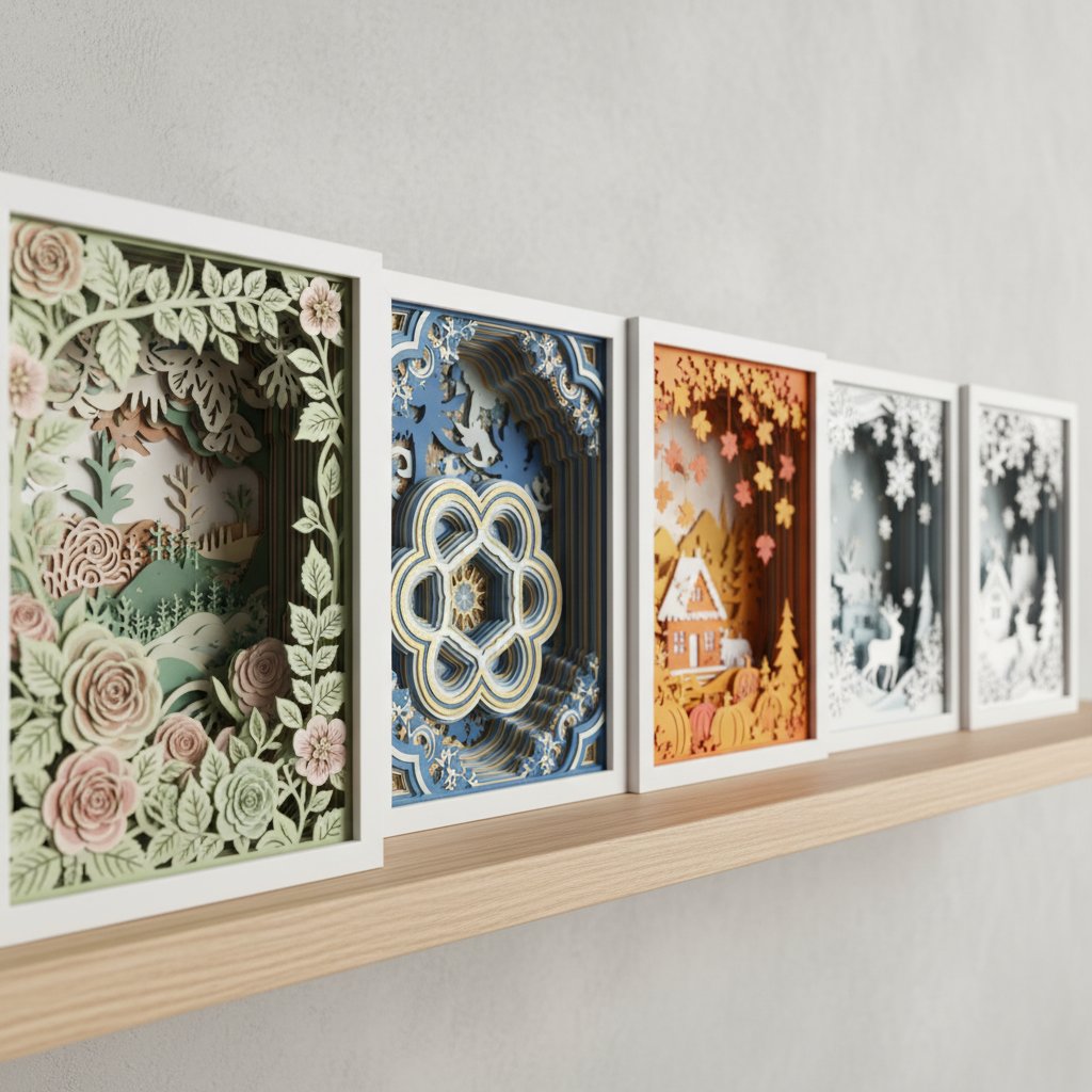
Several finished layered paper-cut shadow boxes of different themes lined up on a shelf

For the deeper theory behind palettes that work on layered paper — complementary vs analogous schemes, how cardstock weight changes perceived saturation — read our color theory guide for layered paper art. One rule I will repeat here because it cost me a wall: cut every layer of every piece from cardstock in the same weight and finish family. Mixing a matte grey with a glossy charcoal destroys the tonal progression at framing distance, even when the colors look identical on the workbench.

Depth, Shadow, and Light: The Paper Art Advantage

Dimensional paper art is the only gallery medium whose appearance changes with the room's light. Used well, that is its superpower. Used badly, it is the reason a beautiful piece looks muddy on the wall. Three decisions control the outcome.

Frame depth sets the drama

Deeper frames cast longer, softer shadows; shallow frames keep shadows tight and high-contrast. For a dramatic gallery wall, choose frames with at least an inch of interior depth. For a calmer, flatter read (bedrooms, nurseries), half-inch depth is enough. Our frame size and depth guide walks through the exact depth ranges that match common layer counts.

Wall orientation sets the daily cycle

A south- or west-facing wall gets direct sun for part of the day, which makes layered shadows stretch and soften through the afternoon — exactly the living-room effect I described in the intro. A north-facing wall gets steady, even light, which is ideal for a bedroom or meditation space where you want the pieces to read consistently. Match the room's purpose to the wall's orientation before you hang anything.

Beware harsh direct sun

Direct midday sun is the enemy of paper art for two reasons: it flattens the shadow contrast you built the piece to create, and it fades cardstock over months. If your only wall takes direct sun, either diffuse the light with a sheer curtain or move the gallery to a wall that catches gentler angled light.

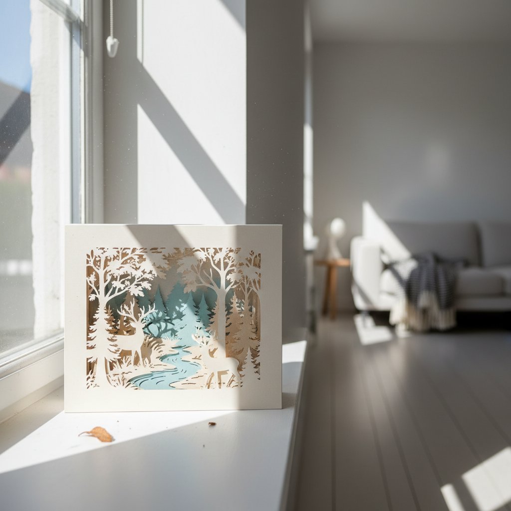
Paper-cut shadow box on a sunny windowsill with harsh direct sunlight streaming onto it

The same piece that looks washed out in noon sun can glow beautifully with a warm-white LED behind it after dark. If you want the full dimensional effect at night, add a faint backlight — it restores the shadow separation that artificial room light tends to flatten. Our LED lighting guide covers safe, low-heat options that will not curl your cardstock.

Templates That Tell a Visual Story
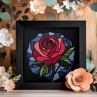
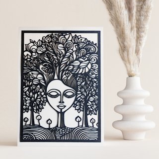
A gallery reads as curated when the pieces share a narrative. The Rose anchors a romantic or warm-palette wall, the Magical Fox carries a story-based scene, and the Mind Tree fits minimalist or meditation spaces. Pick a theme and let the templates do the heavy lifting.

Thematic Storytelling Through Template Selection

Color holds a gallery together at a distance; theme holds it together up close. A viewer standing in front of your wall should be able to sense a through-line — not a literal story, but a consistent idea the pieces are exploring together. Five thematic directions work especially well for dimensional paper.

  • Nature narratives. Arrange botanical pieces as a progression — bud to bloom to seed pod, or a single bloom shown at three scales. A Lily, a Rose, and a Hydrangea in graduated sizes read as a study rather than three separate flowers.
  • Geometric rhythm. Repeat a shape (triangle, hexagon, circle) across pieces so the eye catches the pattern. This is the strongest direction for modern and architectural interiors, and it reads cleanly even in a strict grid layout.
  • Place-based themes. Build a wall around a location — the Seaside Houses with a coastal palette of blues, sands, and whites, or a woodland set in greens and browns. Place themes feel personal because they reference somewhere real to you.
  • Narrative characters. Use a figure or animal as the anchor — the Magical Fox under a tree — and surround it with supporting scenes that imply a setting. These galleries read almost like a picture book and are especially strong in children's rooms and family spaces.
  • Abstract progressions. Contemplative pieces like the Mind Tree, arranged in a vertical column or an asymmetrical cluster, suit meditation corners, reading nooks, and home offices. The lack of a literal subject lets the depth and shadow do the storytelling.

The unifying principle is repetition with variation. Pick one motif — a shape, a subject, or a palette — and let each piece express it differently. Five unrelated pieces arranged on a wall is a collection; five pieces exploring the same idea is a gallery.

Technical Installation: Spacing, Height, and Hanging

Curation gets the art right; installation gets the wall right. The rules below are the ones that, in my experience, separate a gallery that photographs beautifully from one that always looks slightly off.

Center height: 57 to 60 inches

The standard gallery hanging height is 57–60 inches from the floor to the center of the piece. This puts the art at adult eye level and is the convention museums and galleries use. For a gallery wall, calculate the center of the entire arrangement (not each individual piece) and hang that composite center at 57 inches.

Spacing: 3 to 6 inches between frames

For a cohesive grouping, keep 3–6 inches between frames. Closer spacing (3 inches) reads as a single tight cluster and suits smaller walls; wider spacing (5–6 inches) lets each piece breathe and suits large open walls. Anything beyond 8 inches starts to read as separate pieces rather than a gallery.

Hardware for shadow-box weight

Shadow boxes are heavier than flat frames of the same size because of the glass, the cardstock stack, and the deep frame. For anything over 3 pounds, use a wall anchor — a toggle bolt for drywall, or a screw into a stud for the heaviest pieces. Command strips work for small, light shadow boxes under 2 pounds on smooth walls, but I do not trust them for the anchor piece of a large gallery.

Leveling and lighting

Use a level on every piece, not just the first. Frames hung a degree off look visibly crooked once you have four or five in a row. If you have added LED backlighting, position the strip so it throws light evenly across the back layer — a hot spot behind one corner ruins the shadow gradient.

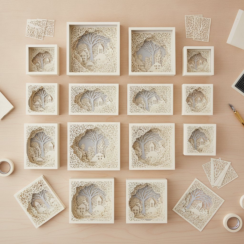
Sets of cut cardstock shadow box layers in several different sizes arranged for various frame dimensions

For frame selection — depth ranges, mat considerations, glass vs no-glass — our how to frame paper art without glass guide covers the display options in detail.

The right gallery formula changes with the room. Here is how I match layout to space across a typical home.

  • Living room (largest wall). This is where the focal-point anchor or a 3×3 grid earns its keep. Give the gallery its own wall — do not crowd it with furniture in front. South- or west-facing living-room walls reward dimensional pieces with the longest daily shadow cycle.
  • Bedroom (calming). Horizontal rows above the bed, in a monochrome or single-accent palette. Avoid busy asymmetrical clusters here; the eye wants rest. Half-inch frame depth keeps the shadow soft rather than dramatic.
  • Home office (inspirational). A vertical column beside the desk, or a small asymmetrical cluster above it. Thematic pieces — abstract progressions or geometric rhythm — suit focused work without distracting from it.
  • Hallway and entryway (narrow). Vertical columns and single linear rows. These spaces are seen in motion, not paused in, so keep the arrangement simple and let one strong piece lead.
  • Dining room (dramatic). The one room that rewards the fullest light strategy — backlit pieces beside a candlelit table look extraordinary. Use an asymmetrical cluster or a focal-point anchor with a deeper frame depth to maximize the after-dark glow.

A note on scale: the most common installation mistake is choosing pieces too small for the wall. A gallery should fill roughly two-thirds to three-quarters of the available wall width. Below that, even a beautiful arrangement reads as undersized and tentative.

Everything above collapses into a seven-step workflow you can run for any wall in your home.

  1. Measure the wall and pick a formula. Note width, height, and what sits in front of it. Choose one of the five layout formulas that matches the wall's shape.
  2. Choose a theme and color story. Decide the through-line — nature, geometric, place, narrative, or abstract — and pick one of the four color stories.
  3. Select complementary templates. Pick templates that share the theme but vary the detail. Browse the full shadow box SVG collection for pieces that fit your palette.
  4. Cut and assemble the pieces. Cut every layer in the same cardstock weight and finish family. Our spacers and alignment assembly guide covers the foam-spacer stacking that creates consistent depth across the set.
  5. Mock the arrangement on the floor. Lay every framed piece out and rearrange until the spacing and the color flow feel right. Photograph the layout so you have a reference.
  6. Template the wall, then hang. Trace frames on kraft paper, tape the templates to the wall, and live with them for a day. Hang the composite center at 57 inches with 3–6 inches between frames, using anchors for anything heavy.
  7. Adjust for light. Watch the wall through a full day and after dark. Re-angle or reposition any piece whose shadows flatten out, and add diffused light or backlight where the depth disappears.

The whole workflow, from template download to a hung and lit wall, typically takes a weekend for a five-piece gallery. The result is a wall no retailer can sell you — dimensional, personal, and responsive to the light of the room it lives in.

Curate Your Own Dimensional Paper Gallery
Build a cohesive floral color-progression wall or mix botanical, coastal, and abstract pieces around a shared palette. Every template is an instant-download layered SVG with tested Cricut and Silhouette cut settings — cut them today, frame them this weekend.
1.How do I arrange shadow boxes without looking cluttered?
Use one consistent formula — linear, grid, asymmetrical, vertical, or focal-point — rather than scattering pieces freely. Keep 3 to 6 inches of space between frames so the grouping reads as one arrangement, match the frames (or keep them in one finish family), and restrict the palette to a single color story. Clutter almost always comes from mixed frame styles and inconsistent spacing, not from the number of pieces.
2.What is the best gallery layout for a narrow wall?
A vertical column of two to four frames works best on narrow walls — beside a doorway, between windows, or in a stairwell. Keep the frames identical in size and hang them with tight, even spacing. Vertical columns draw the eye upward and make a tight space feel taller and more intentional.
3.Can I mix shadow boxes with flat prints on the same gallery wall?
Yes, but treat the shadow boxes as the anchors. Place dimensional pieces at the visual center or ends of the arrangement and use flat prints as supporting elements between them, so the depth variation reads as deliberate. Keep the shared color story consistent across both so the mix of depths feels unified rather than random.
4.How far apart should I space gallery pieces?
Three to six inches between frames produces a cohesive grouping. Closer spacing (around three inches) suits smaller walls and tighter clusters; wider spacing (five to six inches) lets each piece breathe on a larger wall. Beyond about eight inches, pieces start to read as separate artworks rather than a single gallery.
5.Do I need glass on shadow boxes for a gallery wall?
Glass is optional and depends on the look you want. Glass protects the cut layers from dust and is safer in high-traffic or humid rooms, but it can introduce glare that flattens the shadow depth you built the piece to create. For maximum dimensional impact on a gallery wall, many makers prefer glassless float-mounted display. Our guide to framing paper art without glass covers the trade-offs in detail.
6.How many shadow boxes do I need for a 12-foot wall?
A 12-foot wall typically holds five to seven pieces in a linear row, a 2×3 or 3×3 grid, or a focal-point anchor with four to five supporting pieces. The exact count depends on frame size — larger frames (12×12 inch) reduce the count, smaller frames (8×8 inch) increase it. Aim to fill about two-thirds to three-quarters of the wall width so the gallery does not read as undersized.
7.What color story works best for small spaces?
A monochrome progression or a single-accent palette on a neutral base works best in small spaces. Restrained palettes keep the wall calm and make a tight room feel larger, while high-contrast or multi-color stories can overwhelm a small wall. Stick to two or three tones maximum and keep frame finishes uniform.