Articles13 min read

Geometric Paper Cutting: From Basic Shapes to Layered Abstract Wall Art

A complete guide to geometric and abstract paper cutting for Cricut users — shape progression, the color theory that makes layers read as depth, spacing and adhesive techniques, framing, and three build projects. This is the exact workflow we use at MuralMoods Art to turn flat cardstock into dimensional wall art.

A laptop screen showing nested concentric paper-craft layer shapes in different colors stacked to suggest depth

Why Geometric Paper Cutting Is the Best Place to Start

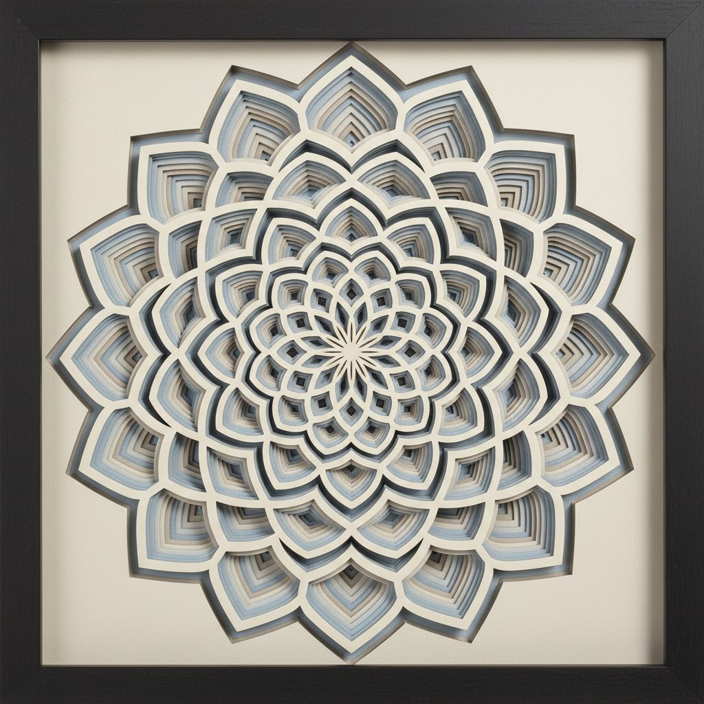
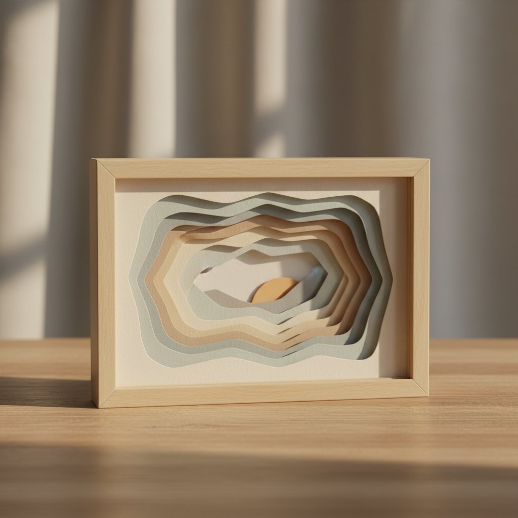
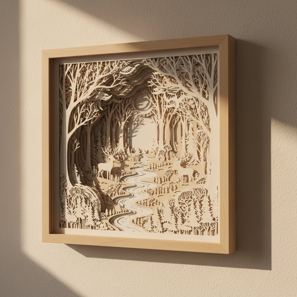
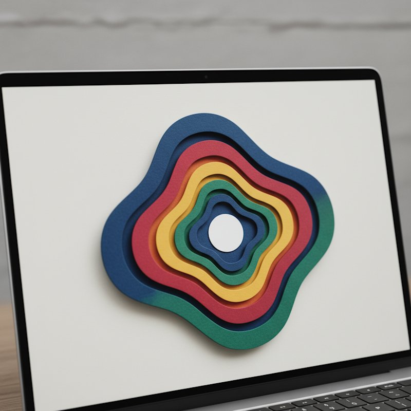
The first abstract piece I finished was a seven-layer geometric mandala in five "contrasting" colors I thought would look energetic. It looked like a confetti explosion. I rebuilt it in an analogous blue-to-teal palette with a single gold accent layer, and suddenly the depth read cleanly — the layers stacked into real space instead of fighting each other. That rebuild taught me the core lesson of geometric paper cutting: the geometry is the easy half. Color and layer spacing are what make a flat stack of cardstock read as a three-dimensional piece of art.

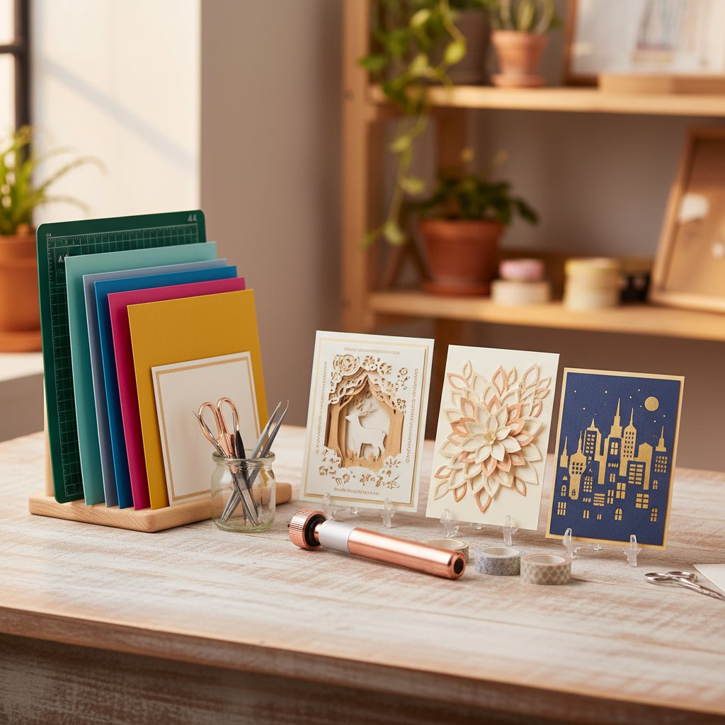
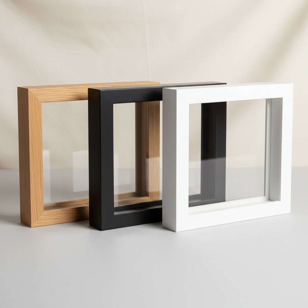
This guide covers geometric and abstract paper cutting end to end, the way we approach it at MuralMoods Art: the shape progression from beginner to advanced, Cricut-specific settings for crisp geometric cuts, the color theory that makes layers work, layering and adhesive technique, framing for home decor, and three full projects (3-layer, 5-layer, and 7-layer). If you are new to paper cutting generally, pair this with our paper cutting tools guide for the supply basics.

A laptop screen showing an abstract paper-craft shape outlined entirely with thin red cut lines on a dark canvas

What Makes Geometric Cutting Different

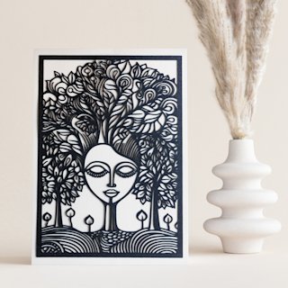
Geometric designs are precision-dependent in a way figurative cutting is not. A deer's antler can be a little rough and still read as organic; a hexagon with a nicked edge reads as a mistake. That precision is exactly why the Cricut is the right tool — a machine-cut geometric line is cleaner than all but the most practiced hand-cut one. The trade-off is that your file prep and material settings have to be dialed in, because the machine will faithfully reproduce every flaw in the SVG.

Start With Geometric Designs Built for Layering
These are the geometric and abstract SVGs we reach for first when teaching layering. The Mind Tree and Seaside Houses designs are pure geometric repetition; the Dragon shows how geometric structure supports an abstract figurative shape. All three cut cleanly on a single Fine-Point blade.

Tools, Materials, and the Shape Progression

What You Need

The geometric tool kit is small: a Cricut (Explore or Maker), a StandardGrip (green) mat for 65–80 lb cardstock, a Fine-Point Blade, a brayer or scraper for smoothing, tweezers for small pieces, and a ruler. For layering you add foam adhesive tape (1/16" and 1/8") and a repositionable adhesive for placement. For materials, 65–80 lb smooth solid-core cardstock is the sweet spot — it holds a crisp geometric edge and stacks without excessive bulk. Our Cricut cardstock types guide breaks down weights in detail.

A tidy craft station with neatly stored colored cutting mats and finished layered papercut cards

The Shape Progression

Geometric cutting rewards a deliberate skill ladder. Skip the rungs and the precision demands overwhelm beginners.

Beginner — circles, squares, triangles. The foundational shapes. The skill here is not the shape itself but cut accuracy: sharp corners that do not round, straight lines that do not wobble. Cut these slowly with a fresh blade and a properly sticky mat and you build the muscle for everything above.

Intermediate — hexagons, pentagons, compound and nested shapes. Multi-sided polygons and nested shapes (a square inside a square, a circle with an internal ring) introduce internal cutouts and tighter tolerances. This is where test cuts start mattering — a 0.04" feature on a hexagon point will tear if your pressure is one notch high.

Advanced — tessellations, mandalas, abstract compositions. Radial symmetry, repeating tessellations, and irregular abstract forms demand the most from your file and blade. Minimum feature sizes drop toward 0.03", and a single dull blade can ruin an hour of cutting. The mandala below is the project that taught me to replace my blade mid-project — lesson learned.

A finished layered paper shadow box featuring an intricate geometric mandala design in a dark frame

Cricut Settings for Crisp Geometric Cuts

For most geometric cardstock, use the Cardstock (for Intricate Cuts) material setting rather than plain "Cardstock." The intricate variant adds a second cut pass, which catches the tiny internal corners geometric designs depend on. Two calibration habits that prevent most failures:

  • Always do a corner test cut on a new design or new material. Cut one small shape in the mat's corner before committing a full sheet. Thirty seconds of testing saves a full sheet of cardstock.
  • Watch blade sharpness. Ragged edges and "needed more pressure" warnings on settings that used to work mean a dull blade, not wrong settings. Our Cricut cardstock troubleshooting bible diagnoses every failure path. For full material settings per paper type, see the Cricut cardstock settings mastery guide.

For SVG prep, convert all shapes to paths (not strokes), keep minimum feature size at 0.04" for cardstock, and cut nested shapes as separate layers (more efficient and lets you color-sync) rather than one fused cut. Our papercut SVG guide covers file sourcing and prep.

Color Theory for Geometric Paper Art

This is the section that decides whether your piece looks designed or random. Geometric and abstract layering leans heavily on color interaction, because there is no figurative subject to carry the composition — color and spacing are the composition.

Glittering and pearlescent metallic specialty cardstock sheets overlapping in rich jewel tones

Four Palettes That Work for Layered Geometry

  • Monochromatic — one hue across light to dark values. The safest, most sophisticated choice. Stack dark values at the back, light at the front, and depth reads automatically.
  • Analogous — two to four adjacent hues on the wheel (blue → teal → green). Harmonious and calm; the palette that rescued my mandala.
  • Complementary — two opposite hues (orange/blue). High impact but volatile; use one as the dominant and the other as a small accent only, never 50/50.
  • Triadic — three evenly spaced hues (red/yellow/blue). Energetic and balanced, but the hardest to control in paper because every layer competes for attention.

Layering Color for Depth

Two principles make layers read as three-dimensional space instead of a flat collage:

  • Value drives depth. Place darker shades behind, lighter shades in front. The eye reads lighter-on-darker as closer. Reverse this and the stack flattens.
  • Reserve contrast for the focal layer. If every layer is high-contrast, nothing stands out. Build four quiet analogous layers and add one metallic or complementary accent on the focal shape — that is the gold layer that fixed my mandala.

Specialty Papers as Color Tools

  • Vellum over a solid color softens and diffuses it — useful for atmospheric background layers.
  • Metallic cardstock catches light and reads as a natural focal accent. Use sparingly (one layer).
  • Glitter cardstock adds texture but competes visually; limit to a single foreground layer so it does not muddy the geometry.

For the full color framework — hue, value, contrast applied to layered paper — our color theory for layered paper art guide is the companion read.

Practice Color Theory on These Layered Florals
Floral shadow boxes are the fastest way to train your color-layering eye. Build the hydrangea in a monochromatic blue set, the lily in analogous warm tones, or the rose with a single metallic accent layer — each one teaches a different palette discipline.

Layering Techniques for Real Depth

Color suggests depth; physical spacing delivers it. The gap between layers is what turns a stack of paper into a shadow box.

Layered paper cut shadow box nature scene with tree silhouettes showing dramatic depth through multiple layers

Layer Order and Visual Weight

Stack back to front: background → mid-ground → foreground. Put larger, darker, denser shapes at the back and smaller, lighter, more detailed shapes toward the front. The deeper a layer sits, the more it should recede in both color value and detail density.

Spacing Methods

  • Direct adhesive (0 to 1/16") — flat layered effect. Good for cards and pieces that will be framed under glass with no depth.
  • Foam tape (1/16" to 1/8") — standard dimensional spacing. Use 1/16" between deep layers and step up to 1/8" toward the foreground to exaggerate depth.
  • Cardstock spacers — stack 2–3 sheets of scrap cardstock as a custom-thickness spacer for precise control on advanced pieces.

Alignment

Misalignment is the most common layering failure, and it gets worse with every layer you add.

Stacked layered papercut shadow box cardstock layers being aligned by hand showing a slight registration offset
  • Registration marks: add a tiny corner notch to every layer in your SVG. Line up the notches and the layers self-align.
  • Repositionable adhesive first: tack each layer with repositionable glue, confirm alignment against a light, then commit with permanent adhesive.
  • Check against light: hold the stack up to a window or lamp between layers — off-by-a-millimeter errors are invisible on the table and obvious backlit.

For the full assembly workflow — spacer placement, adhesive choice, alignment fixes — our assembling layered papercut shadow boxes guide is the deep dive, and the best glue and adhesive guide covers bonding options.

Step Up to Deeper, More Complex Layering
Once a 3-layer piece feels easy, these 7+ layer designs are the natural next step. They reward everything above — value-driven depth, foam spacing, and registration — and each one is dense enough to test your full layering workflow end to end.

Three Projects: Beginner, Intermediate, Advanced

Beginner — Three-Layer Geometric Composition (8" x 10")

A background, a mid-layer of large geometric shapes, and a foreground of small accent shapes. This is the project to run first: it teaches layer order and basic spacing without enough layers to get lost in.

  1. Design: three layers in Design Space, sized to 8" x 10" with a 1/4" margin. Background=largest solid shapes, foreground=smallest accents.
  2. Cut: three contrasting (or analogous) cardstock colors on the Cardstock (for Intricate Cuts) setting, one mat per color.
  3. Assemble: adhere background to a backing board, add the mid-layer with 1/16" foam tape, add foreground accents directly or with thin foam. Frame in a standard 8" x 10".
A finished layered paper-cut shadow box beginner project on a wooden table

Intermediate — Five-Layer Geometric Mandala (12" x 12")

Radial symmetry with a monochromatic or analogous color progression. This is where color theory and spacing start doing real work: each ring steps one value lighter from back to front, with foam tape increasing from 1/16" (deep rings) to 1/8" (center focal). Add a single metallic accent at the center. Expect 2–3 hours including cutting.

Advanced — Seven-Layer Abstract Composition (16" x 20")

A mix of geometric and organic shapes with variable spacing — some layers flush, some on 1/8" foam — and a vellum overlay for atmospheric depth. This is the project that rewards everything in this guide: triadic or analogous-with-accent color, registration notches on every layer, a fresh blade, and shadow-box framing to preserve the dimension. Budget 4–6 hours and replace the blade halfway if edges degrade. For a full shadow-box build walkthrough, see the complete shadow box guide.

Framing and Display: From Cut Stack to Wall Art

A geometric piece is not finished until it is framed and hung. The frame is part of the depth illusion.

Empty shadow box frames in natural wood, matte black and white finishes compared side by side

Frame Choice

  • Shadow box frames (1/4" to 1/2" depth) — the correct choice for any dimensional piece. Standard flat frames compress the layers against the glass and destroy the depth you built.
  • Floating frames — show the layered edges; good for geometric pieces where the edge stack is part of the design.
  • Float-mount with spacers — for a gallery look, mount the art on spacers inside a deeper frame so it appears to float.
Papercut art float-mounted in a deep glassless shadow box frame on a wall

Sizing for the Wall

Match the piece to the wall. 8" x 10" and 11" x 14" pieces belong on shelves, in gallery walls, or above small furniture. 16" x 20" and 18" x 24" are focal-point sizes for above a sofa or bed. 24" x 36" and larger are statement pieces for large empty walls. Our canvas print sizing guide covers room-by-room dimensions that apply to framed paper art too, and the DIY shadow box ideas and DIY paper wall art guides have display inspiration.

Protecting the Work

Paper fades. Two protections matter: hang finished pieces out of direct sunlight, and use UV-protective glass or a UV-resistant spray on pieces in bright rooms. The preserving paper art from fading guide covers long-term protection in detail.

Statement Pieces Built for Shadow-Box Display
These designs are sized and structured for the deeper shadow-box framing geometric art deserves. Build one, frame it deep, and hang it as a focal point — the layering depth reads best behind real glass with real spacing.

Troubleshooting Common Geometric Cutting Issues

Geometric designs fail in predictable ways. Here are the four you will hit.

Tearing on internal corners. Cause: pressure one notch too high or a dull blade dragging at corners. Fix: step the material setting down one level, do a corner test cut, and replace the blade if edges look furry. The Cricut cardstock troubleshooting bible has the full decision tree.

Incomplete cuts on tiny features. Cause: the intricate-cuts setting was not selected, or the feature is below 0.03". Fix: switch to Cardstock (for Intricate Cuts) for the extra pass, and thicken sub-0.03" features in the SVG.

Layer misalignment that compounds. Cause: no registration marks and visual-only alignment. Fix: add corner notches to every layer in the file and check alignment against a light between layers — small errors are invisible flat and obvious backlit.

Colors that clash once layered. Cause: too many high-contrast layers competing. Fix: drop to a monochromatic or analogous base and reserve contrast for a single accent layer. You cannot un-glue a clashing stack, so dry-lay the colors under your room lighting before any adhesive.

Geometric Paper Cutting FAQ

Can I do geometric paper cutting without a Cricut?

Yes. A sharp craft knife, a metal ruler, and a self-healing mat will cut clean geometric lines — start with larger shapes and simpler designs. The Cricut's advantage is repeatability and precision on small internal features; hand-cutting wins on zero setup time for single large shapes. Many artists combine both.

What's the best paper weight for layered geometric cutting?

65–80 lb cardstock. Lighter paper tears on internal corners; heavier paper is hard for the blade to cut cleanly and adds bulk to layered stacks. For highly detailed layers, 65–70 lb gives the best balance of durability and cuttability. See our cardstock types guide for the full weight breakdown.

How many layers should a beginner start with?

Three — background, mid-layer, foreground. Three teaches layer order and basic spacing without overwhelming alignment. Move to five for intermediate work and seven-plus only once alignment and color theory are solid.

What colors work best for geometric paper cutting?

For calm, sophisticated pieces, use analogous colors (adjacent on the wheel) or monochromatic (one hue, varied value). For high impact, use a complementary pair with one dominant and one accent — never 50/50. Reserve metallics for a single accent layer.

How do I keep paper layers from curling after adhesive?

Apply adhesive to both surfaces, wait about 30 seconds for tack, then press from the center outward with a brayer. For stubborn curl, weight the piece under books for 10–15 minutes. Use spray adhesive or a glue runner for large areas to avoid wet-paper warp.

How do I frame layered geometric art without flattening the dimension?

Use a shadow box frame with 1/4" to 1/2" of depth. Standard flat frames press the layers against the glass and destroy the spacing. If you must use a standard frame, add foam-board spacers at the corners to create a gap between glass and art.

What Cricut blade should I use for geometric cardstock?

The Fine-Point Blade (blue housing) handles 65–80 lb cardstock. Move to the Deep-Point Blade (red housing) for stock over 80 lb or for cutting 2–3 layers at once with a multi-pass. Always run a test cut on a new material.

Can I sell geometric paper art I make from SVG templates?

Yes, if the SVG license permits commercial use — the templates in our shop are licensed for finished-piece sales. Cricut Access images are personal-use only. Always confirm the license on any file you cut for sale.

Start Your First Geometric Piece

Geometric paper cutting rewards preparation over improvisation. Pick an analogous or monochromatic palette before you touch cardstock, dial in the Cardstock (for Intricate Cuts) setting with a corner test cut, add registration notches to every layer, and frame the finished piece in a real shadow box. Do those four things and the depth reads the way you pictured it — the way it finally did for my mandala once the palette stopped fighting itself.

If you want one next step, grab a geometric SVG from our shadow box catalog, build it in three layers with 1/16" foam spacing, and frame it deep. That first clean geometric shadow box is the piece that makes the whole workflow click.

Save this guide — bookmark it or pin it so the color-palette and layer-spacing rules are one click away when your next stack of cardstock is on the table.


Happy cutting — and may your layers always read as depth, not as noise.